With Brent and WTI crude both surging to post-GFC highs Friday, I’m beginning to suspect that the world has entered a new era of oil price and growth volatility that spells the end of the Great Moderation. Why so?
Supply and demand are the key to all things economic. Previously at this site, the Unconventional Economist has used the below demand curve graph to dispel simplistic notions about supply shortages in the housing market resulting in a one way bet for house prices.
For oil, the same macroeconomic principle can be used on a much larger scale. Indeed, I believe this formula explains the likely pattern of world economic growth for as far as the eye can see. (This post is a bit technical, but please bear with me, your future may depend upon it.)
The growth motor of the global economy for now and into the future is emerging markets. Mature Western economies are burdened with public and private sector over-indebtedness. This has created a feedback loop of deleveraging that sees their service sectors struggle, whilst their high costs of production sees their industrial complexes bleeding capacity to cheaper (emerging) labour markets.
On the other hand, emerging markets typically have low indebtedness, are absorbing much formerly Western industrial capacity and, in many cases, also dominate raw materials supply to feed the urbanisation that goes along with their rapid development.
Martin Wolf of the FT has described this macro scenario as the great convergence. In short, emerging markets get relatively richer, as Western nations get relatively poorer.
The biggest impact of this global growth pattern has been on the demand for raw materials and energy as emerging markets’ urbanisation and rising living standards use up more of the supply of basic commodities that fuel and build modern life.
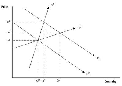
Like housing supply in Australia, commodity supply is inelastic. That is, it cannot respond quickly to a sudden surge in demand. The chart offered below (and mentioned above) shows the effects on any given market if supply cannot respond quickly. Don’t be scared of it, it is easier than it looks:

Q0 and P0 represent the initial equilibrium situation in any market. Initial demand is provided by D0, whereas supply is shown as either SR (restricted) or SU (unrestricted).
Following an increase in demand, such as a surge of emerging markets looking to engineer an historically swift catch-up in living standards through mass urbanisation, the demand curve shifts outwards from D0 to D1. When commodity supply is restricted, prices rise sharply from P0 to PR. By contrast, when supply is unrestricted, prices rise more gradually from P0 to PU.
The situation works the same way in reverse. For example, if there was a sharp fall in demand following a contraction like that of the GFC or an inflationary bust causing commodity demand to fall from D1 to D0, then prices fall much further when commodity supply is constrained.
The graph illustrates that demand shocks combined with inelastic supply do not result in a one way bet of upwards price movements. Rather, such economic settings produce volatility, with steeper price rises and spectacular collapses.
Why you might ask? It’s pretty simple. This is a mathematical representation of human panic. When a market is perceived to be unable to increase supply easily then speculators move in. In strategic markets like oil, governments begin to fret about security of supply. They stockpile. More speculators enter the market. So on, and so forth.
So long as the perception that supply is constrained remains, the frenzy continues until it exhausts itself in a new crash.
For the global economy, this dynamic is now apparent across a spectrum of commodities. None, however, is more important to the prospects and pattern of global growth than oil.
As I wrote recently, for much of the last decade, oil has been priced on the assumption that supply is in jeopardy of being unable to respond to burgeoning demand. The situation first arose in 2003 when, ironically, the US invaded Iraq:

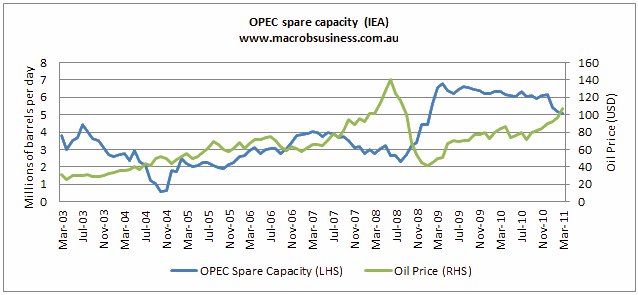
As the graph shows, that invasion marked two vital turning points in the oil market. The first was that OPEC’s spare capacity became severely constrained on geo-political concerns and, second, it was the last time that the world saw oil priced in the $20 range, in my view, for good. From 2003 to mid 2006, OPEC’s spare capacity oscillated in a band between one and three million barrels per day and the oil price more than doubled from $30 to $80. For the following year, spare capcaity rose to four million barrels and the oil price corrected to $60.Then, as the last growth cycle wound itself toward its blowoff hase, and spare capacity dropped toward 2 million barrels again, the price skyrocketed.
Because of the oil market’s crucial role in production of just about everything, and because of contemporary concerns about peak supply, as well as the MENA crisis, we have now reached a point where five million barrels per day spare capacity is not enough to keep the price below $100 per barrel. The panic that surrounds oil is such that speculators can now rule the market.
Moreover, I believe these same dynamics are now loose in any number of grain markets, as well as many other metals and bulk commodities, like iron ore. Though at least in the ore market, supply can ultimately respond. Oil has permanent knock-on effect to grains as more and more space is given over to ethanol production.
If I’m right, this surely represents some new built-in limit on future global growth cycles as inflationary bursts ripple through the global economy every time it accelerates. At least so long as the current emerging market growth leadership is sustained.
The Australian Treasury and RBA are counting on the endless boom in our terms of trade becasue of the same dynamics. In my view we’re in for something much more volatile.

