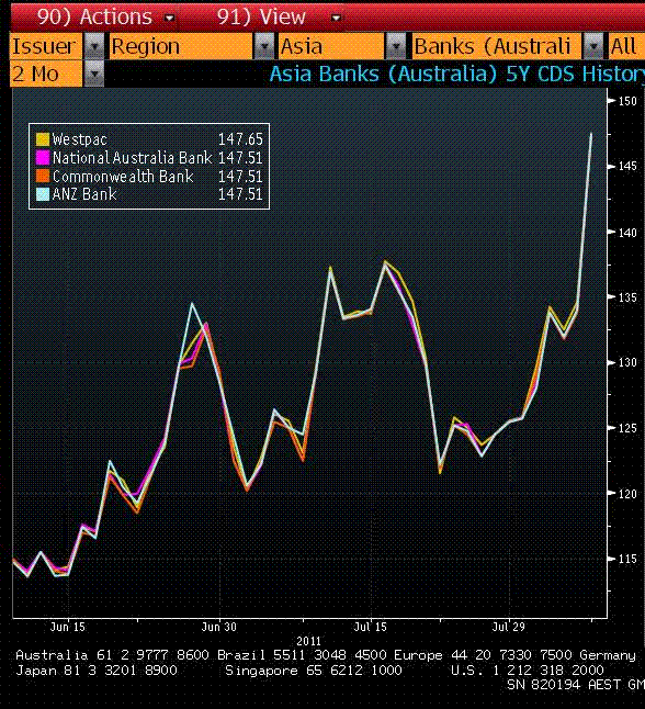
Find below a chart of recent CDS price movements for the major banks:
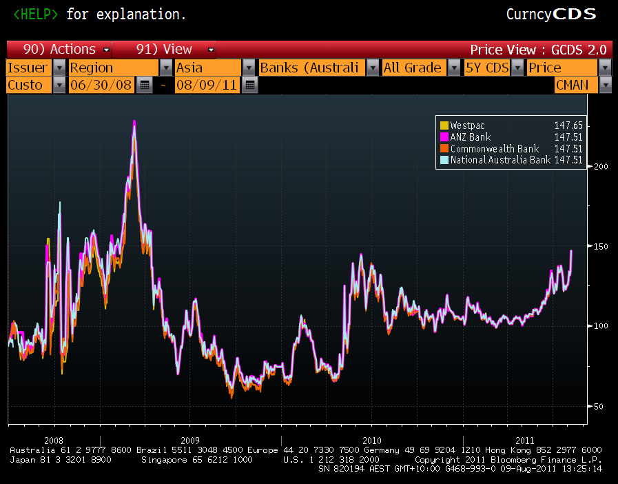
And for a longer term perspective, try this one:

This chart tells us a couple of things. First, the cup and handle formation identified last week has now delivered its promised surge and we have broken through the level set in the first round of the European crtisis in May 2010.
Advertisement
Second, if we take CDS prices as a proxy for bank funding pressures, we can see also on this chart that although the rise is alarming, it will have to be significant and sustained ala 2008 to cause the banks actual distress.
We will track it.


