More on GDP
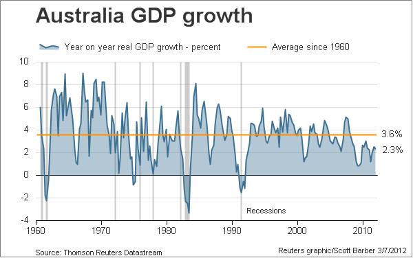
After yesterday’s hoopla over the December 2011 GDP figures, where I also studied the per capita growth rates, Scotty Barber at Reuters produced this chart of year on year real GDP growth since 1960:

For those unsure about the trend, you see that orange line? That’s the average trend growth rate. Take note of the current rate.
The downtrend is clear and obvious, with real GDP growth decelerating since the turn of the millennium and unable to gain traction post-GFC. The economy is still growing, but below trend on a GDP per capita and total basis, even after enormous stimulus (both local and external) applied to it since the nadir of the GFC.
The question not being asked, is whether the current under-trend growth rate can be sustained, given that a further stimulus is unlikely with a government hell bent on returning to surplus, and over-indebted Australian households unwilling to borrow more to fund the private sector gap.