Chart of the Day: EU youth unemployment
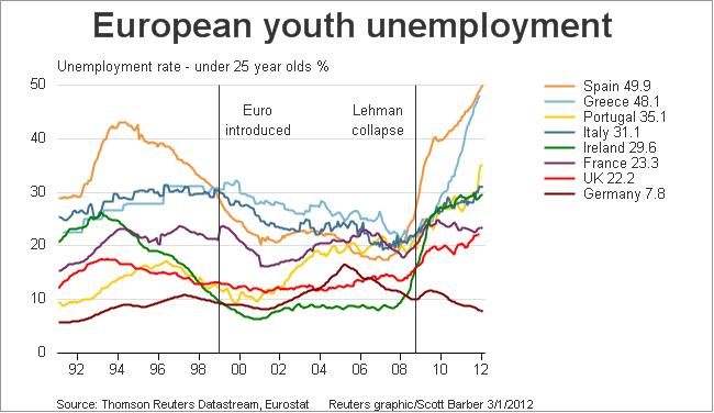
This is a shocking chart, it came up on Twitter last night, so I had to share it:

It’s from Scotty Barber at Reuters, showing youth unemployment (under 25 year olds) from before, during and “after” the GFC.
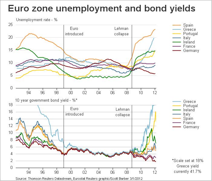
What immediately springs to mind – apart from the near 50% rates in Spain and Greece, is doesn’t this look eerily similar to the 10 year government bond yield chart over the same countries?
I asked Scotty last night and he sent me this, which tracks adult unemployment against bond yields:

This is a major macro trend that Delusional Economics has covered previously – beyond the LTRO Bazooka, something has to be done about not only the chronic unemployment but the generational chasm that is deepening across Europe. It’s going to take more than adjustment.