Chart of the Day: Jobs are in the male
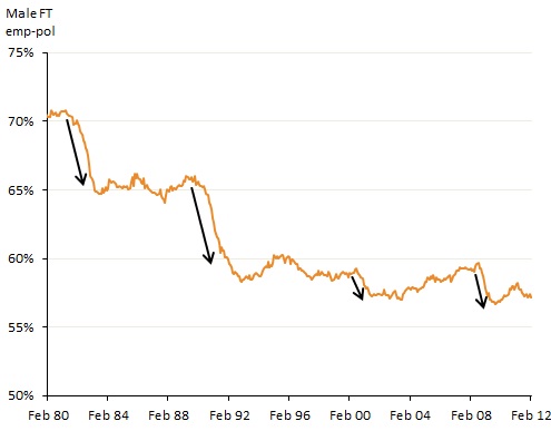
From Matt Cowgill comes this very interesting long term chart of male full time employment as proportion of population:

The data source is the ABS Labour Force stats (release 6202, table 2). From these figures the population numbers, Matt has calculated the male full time employment to population ratio.
Notice how on every downturn, the rate falls to a new average low, and is currently sitting above the 55% mark. More telling for this tea-leaf reader is the pattern from 2003 onwards, which seems to replicate the 2003-2007 pre-GFC share market and recent gyrations. The large blip in late 2009 through 2010 was probably due to the Federal Government economic stimulus – most likely the NBER – construction being a large “soaker” of male employment.
It remains to be seen if the drive to surplus will incur a lower rate as unemployment remains steady or ticks up due to the ongoing household debt deleveraging. This is another metric worth watching…