This is a guest post from long time reader Jackson, who I have been in correspondence with since I started my articles on superannuation. The following analysis was done completely independently of my own research:
There has been a lot of recent chatter about the asset allocation of superannuation, with an emerging contrarian view that the majority of Australian superannuation accounts are overweight in equities, and underweight in fixed interest components. Whilst it’s pretty obvious that there is no ideal allocation that you can “set and forget”, the majority of accounts end up this way.
As an MB tragic, what drives me nuts is the absolute lack of quantitative analysis out there. What does the data actually say? Can we make any quantitative sense of it?
I thought it might be useful to present some results of my own analysis in this area. My objective was pretty simple – what is the probable outcome for my superannuation, if I use a pretty dumb set-and-forget strategy? Of course I’m not going to do that, but framing the problem this way should give a conservative set of outcomes, and remember most accounts end up this way.
The approach was as follows:
- take the data from annual returns posted by The Prince here,
- build a statistical distribution from the data,
- create the ability to choose an asset allocation that varies in time, and
- run a Monte Carlo simulation to determine a distribution of possible outcomes from that choice.
To simplify the problem, I chose a 30 year time horizon, an initial account balance of $100K, and annual contributions of $10K. All calculations are in today’s dollars and fees have not been accounted for. There are only two choices for asset allocation – fixed interest and equities. I used both the Australian fixed interest and equities data, as they are correlated well with their international equivalents but the positive returns are higher and the negative returns are less negative.
The asset allocation can be changed once annually at any time over the 30 year time horizon. The analysis of course assumes that the statistical distribution of past performance is an indicator of the statistical distribution of future performance, which may well not be the case but is the same information all advisers and commentators make prognostications upon.
I report three numbers from each simulation – the 25th, 50th and 75th percentile. You have a 25% chance of ending up with less than the 25th percentile (ie 1-in-4 of getting less than this value), a 50% chance of ending up with less than the 50th percentile, etc.
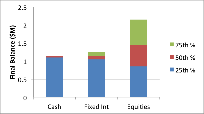
Let’s start with the dumbest of the dumb – a single asset allocation for 30 years, either cash, fixed interest or equities.

An interesting result – whilst the 50th percentile (the median) gets larger with the more risk you are prepared to take on, the 25th percentile gets smaller. In other words, for cash only you are 25% likely to end up with less than $1.1M in the example above, but for 100% equities this number is $850K – a worse result.
The distribution is far more spread for equities, both to the high and low end. If you’re an optimist, it’s all roses in equities. If you’re a pessimist, or just plain unlucky, then maybe you want to bolster your portfolio with something a little less volatile.
With those building blocks in mind, the issue is really one of limiting the downside risk whilst preserving the potential upside – the absolute return approach. The premier question is what combination of fixed interest and equities will do just that? What gives you a pretty solid 25th percentile outcome (ie a 3 in 4 chance of doing better than that), with a rosy picture if you get lucky?
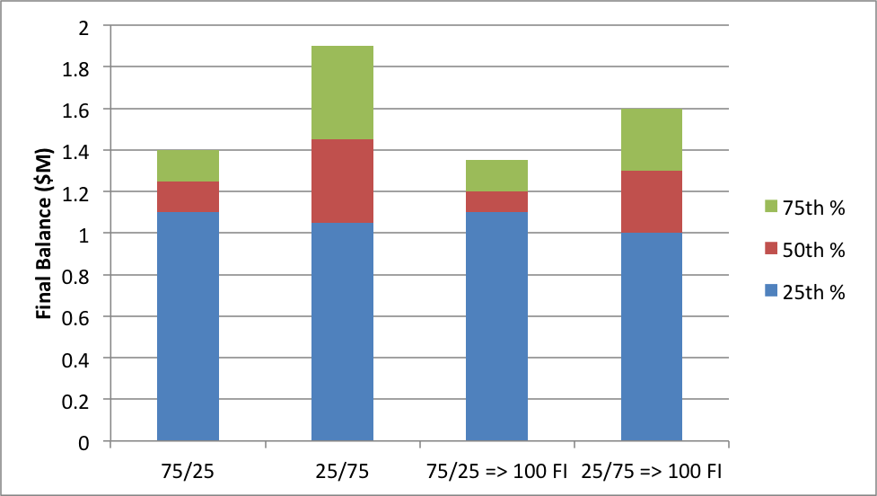
I consider four cases:
- a 75% fixed interest, 25% equities split for the entire 30 years (75/25);
- a 25% fixed interest, 75% equities split for the entire 30 years (25/75);
- the 75/25 split for the first 20 years, moving to 100% fixed interest for the last 10 years (75/25 =>100 FI); and
- the 25/75 split for the first 20 years, also moving to 100% fixed interest for the last 10 years (25/75 =>100 FI).
These last two are meant to replicate the oft-quoted approach of moving to less volatile asset allocation as you approach retirement.

Given the first set of results already shown above, there should be little surprise that the 75/25 fixed interest/equities split gives a higher 25% percentile, but lower 50% percentile, than the 25/75 split. So are you a glass half-empty, or glass half-full person? Do you want to take a 1-in-2 chance on your retirement balance, or a 3-in-4?
For the final two examples, those that move to fixed interest in the last 10 years actually do worse than if you’d left it alone – all percentile values are lower. This seems to suggest you’ve chopped off the upside opportunity in the last decade of your working life, and the decision to move into a low volatility asset allocation is more likely to be about risk aversion than a statistical assessment of probable outcomes.
There are an infinite number of potential combinations, but I’ve found the ones described above the most instructive. Much to my surprise, the outcomes of this are pretty much in line with the barbell approach The Prince was discussing late last year (in a nutshell, be overweight fixed interest against a small allocation to shares). This analysis was done completely independently.
I’m more than happy to provide the spreadsheet used to create this freely to anyone, so long as you accept it’s assumptions, failings, projections and outcomes do not construe any kind of advice on my part. Constructive criticism welcome!