With the commentariat locked in a debate over whether the Australian housing market is facing a bubble, brought about by near record low mortgage rates, intense investor participation, and rising prices, it is worth revisiting the work of Philip Soos, masters research student a Deakin University, who has recently updated his chart pack tracking 150 years of Australian housing data on his website.
Below are a selection of Soos’ charts, the remainder of which can be viewed here.
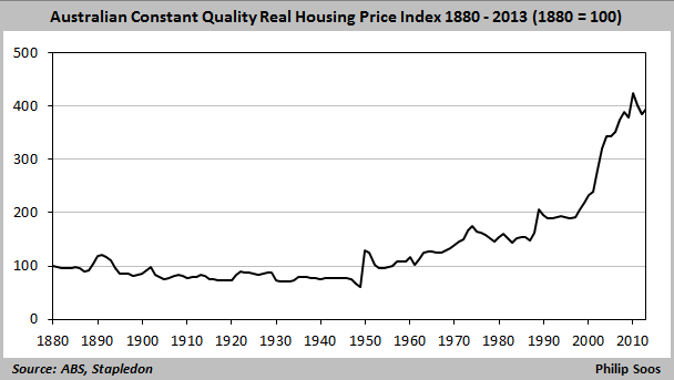
The most obvious indicator of housing over/undervaluation is the long-term trend in housing prices, adjusted for inflation and quality. Prices increased by 123% between the trough in 1996 and apparent peak in 2010. After retracing over the next two years, prices are now back on the rise.
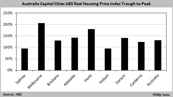
According to the ABS, all capitals experienced strong growth in real house prices from the mid-1990s trough to the peak in the 2000s, with Melbourne leading the way.
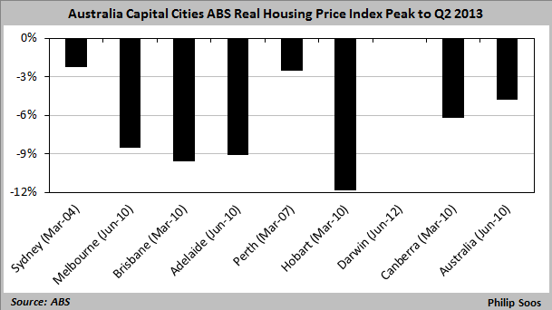
As at the 30 June 2013, all capitals except Darwin were still “underwater” in real inflation-adjusted terms, with house values nationally around 5% below their June 2010 peak.
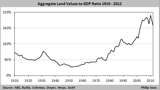
As argued previously on this site, the strong growth in Australian Australian housing values has been caused by escalating land prices, which roughly doubled as a percentage of GDP from the trough in 1996 through to the peak in 2010.
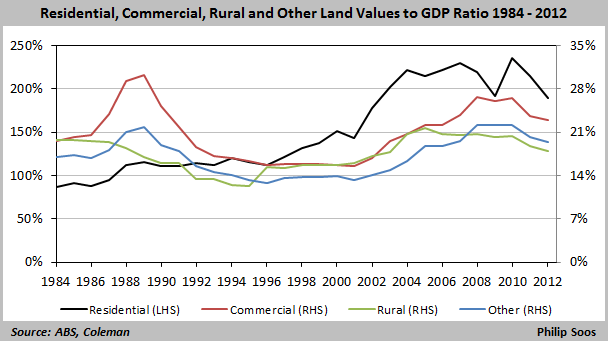
In the mid-1980s to early-1990s, the froth was in the commercial land market, whereas today it is within the residential land market.
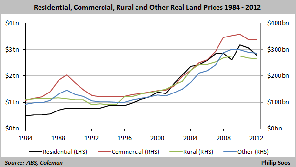
The entire land market is now worth $3.7 trillion, with residential land at $2.8 trillion.
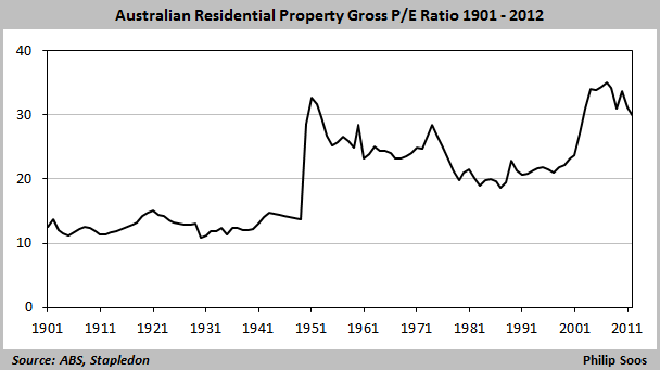
Another popular method of determining property valuation is comparing housing prices to rents. In a fairly efficient market, the costs of buying and renting should closely match each other; although due to factors such as taxes, risks, and interest rates, it is unlikely that costs will equal. As you can see, this ratio is currently highly elevated suggesting housing is significantly overvalued.
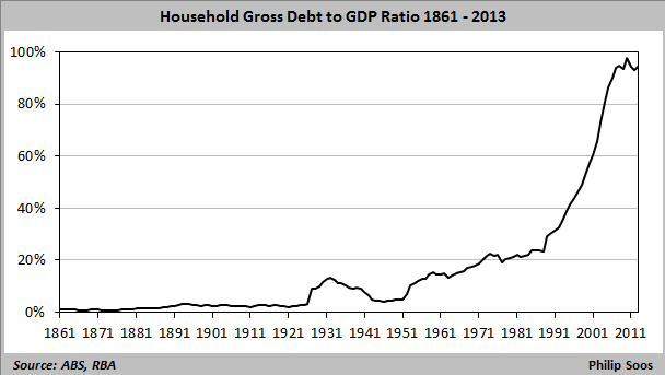
A key determinant of the boom/bust cycle in the land market is the availability of credit/debt used to fund housing. The ratio of household debt to GDP (the majority of which is mortgages) has more than quadrupled since 1988, rapidly accelerating during the 90s and 2000s. The ratio peaked in 2010 as did real housing prices, which is clearly no coincidence.
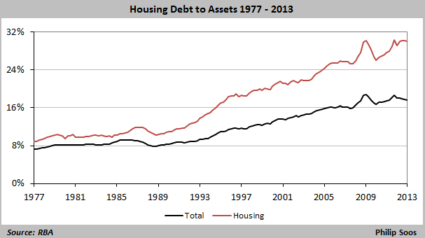
As household debt has climbed, so too has debt as a percentage of household assets. It has tripled from 1990 through to 2008 before the GFC, falling and then resuming its upward climb.
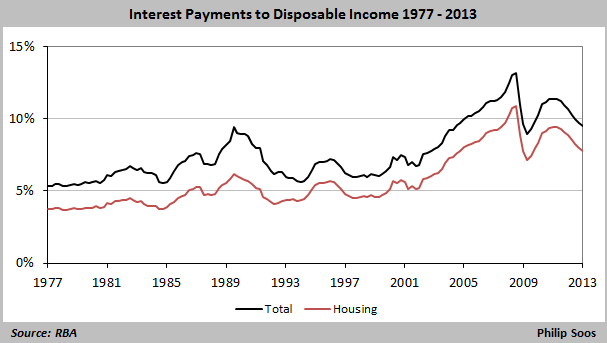
Despite mortgage rates falling to near record lows, the proportion of aggregate household income chewed-up by mortgage interest is still well above that of the late-1980s/early-1990s, when mortgage rates peaked at 17%. This is because of the inflated housing values and the corresponding high debt loads carried by Australian households.
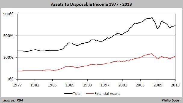
Australia does indeed appear to be over-invested in housing. In addition to housing’s lofty valuation compared to GDP (see earlier chart), nearly 60% of Australian household assets are tied-up in housing, making it by far the dominant asset class in Australia.
While most mainstream commentary is focussed on whether or not Australian housing may be entering a bubble owing to current conditions, a long term perspective makes it clear that the base from which current prices are rising is already dramatically inflated.

