
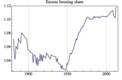
First we have a metric that I call ‘Excess housing share’, which is the ratio of total dwellings to occupied dwellings. Notice the massive construction boom during the ‘golden years’ of the post- WWII boom until the 1970s. We can even see the blip of the naughties construction boom.
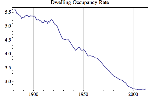
Second is the dwelling occupancy rate in persons per dwelling. There appears to be both and inter-war decline in occupancy, as well as a post-WWII long boom when occupancy rates declined all the way to 2006 when it hit a low of 2.72.
The last metric I call ‘Excess rental growth’ which is the CPI divided by the housing rental price index, which is a cumulative measure of the increase in average residential rents over CPI. Since the 1950s rents have outpaced CPI, with a relatively stable period between the mid-1970s and mid-2000s. We are now at an historically unprecedented level of ‘excess rents’. Luckily I didn’t start this graph in 1955 because it would have been one hell of a shock, with rents growing 60% faster than CPI since that time on average.
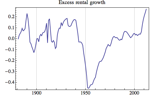
If my gut is correct, the emerging trend of below-CPI rental growth will be with us for a few more years until this measure drops back.
I must note that some of this recent increase, and indeed some of the dramatic post-WWII increase will be attributable to the ever-changing measurement practices and techniques for both the CPI and rental index themselves. The very recent jump also has much to do with currency effects and terms-of-trade driven boost in real incomes (since rents are primarily determined by incomes). We can really only trust the short-term directions, and not the long-term magnitudes.
Please share this article. Tips, suggestions, comments and requests to rumplestatskin@gmail.com + follow me on Twitter @rumplestatskin