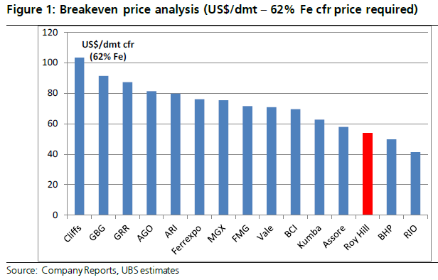
It’s interesting to look at the charts of Australia’s iron ore juniors and compare that with the cost curve. Here’s the UBS estimate of break even costs:
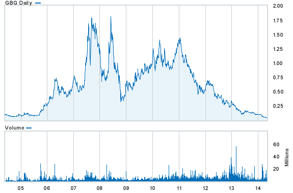
And now in order of highest to lowest, GBG:
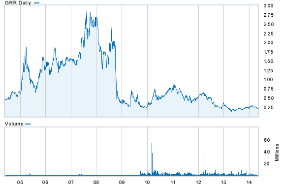
GRR:
Advertisement
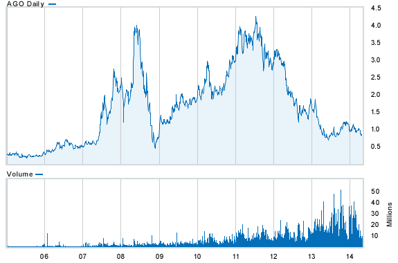
AGO:
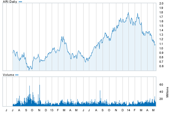
ARI (which is not a pure play):
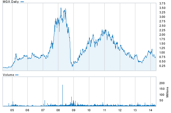
MGX:
Advertisement
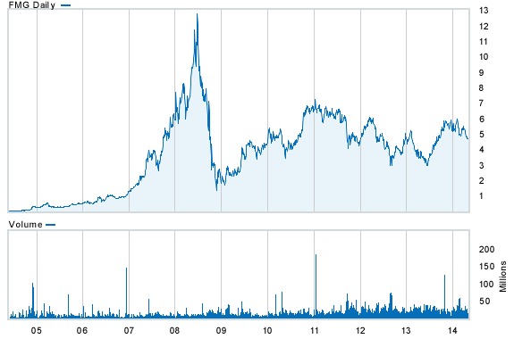
FMG:
And BCI:
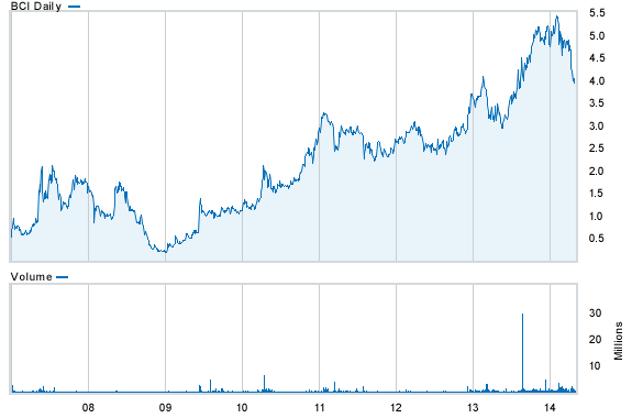
Note the relative out-performance the further down the cost curve you go. Hard to say what iron ore price is priced into equities but I’d suggest it’s not much worse than $100. There is roughly 50 million tonnes per annum of production in Australian juniors sitting above FMG.
Advertisement