RPData’s latest monthly round up is out.
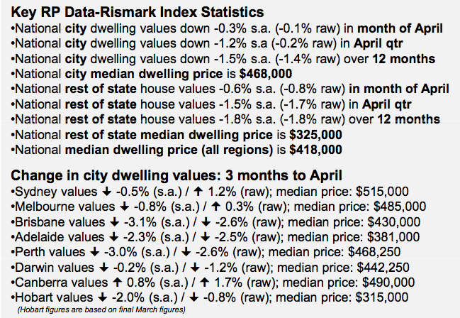
The near-double interest rate hike in November last year has bitten, with seasonally-adjusted Australian capital city dwelling values down 1.2% in the three months to end April, although in raw terms home values are mostly unchanged (-0.2%). Expensive suburbs have been the poorest performers in line with the share market.
Based on more than 85,000 home sales nationally in 2011, the market-leading RP Data-Rismark Home Value Index for the combined capital city dwelling markets declined by – 0.3 per cent (seasonally-adjusted) in the month of April (or -0.1 per cent in raw terms). This is in line with RP Data- Rismark’s forecasts since late 2009 (see quotes).
Over the three months since the January floods, dwelling values in Australia’s capital cities have tapered by -1.2 per cent on a seasonally-adjusted basis. In raw terms, dwelling values have declined by a much more modest -0.2 per cent. The difference between these two results reflects the fact that the housing market typically experiences higher rates of capital growth at the start of each year, which is reflected in the seasonally-adjusted data.
In the 12 months to end April, Australian capital city dwelling values are now down -1.5 per cent (seasonally adjusted). This trend is also reflected closely in the regional markets. RP Data-Rismark’s ‘Rest of State’ index tracks house values in all non-capital city areas, which account for about 40 per cent of the population. In the three months to end April, house values in the ‘Rest of State’ regions fell by -1.5 per cent seasonally-adjusted (- 1.7 per cent raw). Over the 12 months to April, ‘Rest of State’ house values are off by -1.8 per cent.
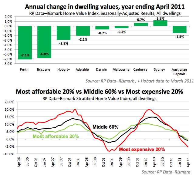
According to Tim Lawless, RP Data’s research director, expensive suburbs have helped drag the overall market down. RP Data and Rismark divide their capital city index into three sub-indices: the bottom 20 per cent of suburbs ranked by price, the middle 60 per cent, and the top 20 per cent.
Over the year to end April, dwellings in the most expensive capital city suburbs recorded a -5.4 per cent loss (see second chart). In contrast, home values in the middle 60 per cent of suburbs were down by only -0.9 per cent. Dwellings located in the cheapest 20 per cent of suburbs were the best performers, hardly moving (-0.5 per cent).
RP Data’s Tim Lawless commented, “The solid performance of cheap suburbs runs against the grain of popular claims that default rates are rocketing up amongst first time buyers, which the RBA recently rejected.”
“The luxury end of the housing market is also showing its volatility. During the growth phase of the cycle the most expensive homes realised the highest capital gains. Yet as the market cools premium home values seem to be losing steam the fastest,” he said.
Rismark Joint Managing Director, Christopher Joye, added, “The uber-luxury segment is risky and highly illiquid and has had the rug whipped from under it via a combination of the soaring Aussie dollar and the volatile share market. A final fly in the ointment is the much lower growth – and pay packets – expected in the financial services industry going forward. Luxury homes in areas like Sydney’s Eastern Suburbs will continue to face valuation headwinds as banks deal with the new normal of subdued credit growth.”
A couple of comments about this release.
It does seem from the capital city data that the price falls are moderating. You can see from the table below what it happening according to RPData’s index.
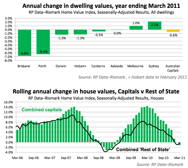
However, I am always suspicous when someone makes a change to their presentations mid-stream. I really like the separation of the data presented in the “most affordable, middle, most expensive” chart, and I hope to see it again, but that chart is something I haven’t seen before. For the previous press releases the charts have looked as they did in March (see below).
You will note that the second chart is suddenly absent in the May press release even though it has appeared in every other release this year. Now I am aware that I could be being overly suspicious here, but when you are in a battle for the hearts and minds of the public about who is the leading provider of data on the housing market, a “mid-stream switcheroo” certainly does not help your cause.
Once you take a look at the data that is absent from graphical representation this month (i.e. the rest-of-state data) and recognise that it represents around 40% of the housing market, you can understand why a contrarian such as myself becomes a little suspicious of its absence.
If you compare the April and May press releases you can see the change in the rest-of-state data. From the April press release:
- National rest of state house values +0.2% s.a. (+0.4% raw) in month of Mar
- National rest of state house values -1.8% s.a. (-0.7% raw) in Mar qtr
- National rest of state house values -0.5% s.a. over 12 months
And now May:
- National rest of state house values -0.6% s.a. (-0.8% raw) in month of April
- National rest of state house values -1.5% s.a. (-1.7% raw) in April qtr
- National rest of state house values -1.8% s.a. (-1.8% raw) over 12 months
You can determine yourself whether you think this supports the underlying premise from the commentators at RPData that the housing market is stabilising. From my perspective I would like to see RPData publish the “Rolling average change in house values, capital cities V Rest of state” chart for this month so everyone could gain a better understanding of what is happening across the whole market. I am sure people living in Mount Isa have just as much interest in what is happening to the value of their property as do those who live in Bankstown.
I have stated a number of times that I consider RPData’s hedonic index to be conceptually superior to the data provided by other companies, and it may be that Mr Joye and Mr Lawless have it correct, but to suddenly change your data presentation at this time, in my opinion, is a not helping their case.
I must also take issue with Tim Lawless’s statement
“The solid performance of cheap suburbs runs against the grain of popular claims that default rates are rocketing up amongst first time buyers, which the RBA recently rejected.”
Tim’s comments reflect a macro-view of the data that every first home buyers lives in the “average” suburb. This is simply not the case, and the fact that the overall view of the “cheaper” suburbs shows that the growth is flat over the last 12 months hides the fact that some suburbs (noticeably in Perth and Brisbane) would be far worse off. If we also include rising costs of living, the fact that interest rates have risen significantly in percentage terms in the last 18 months, and the fact that some first home buyers may have taken on loans with very high LVRs, it is quite possible that banks are seeing rising defaults amongst this cohort even with flat aggregate data.
I also take issue with the press release’s statement that the modest decline in home values are “in line with RP Data-Rismark’s forecasts since late 2009”.
If this is the case, then can RP Data please explain the following quote from Mr Lawless on 18 June 2010:
Our view is that home value growth is likely to moderate, tracking household income growth which is likely to be circa 5 per cent over the coming year.
Given that RPData acknowledges the growing stock on market, it will be interesting to see the other data providers’ releases.


