Churn baby, churn
Last week, Delusional Economics posted an article entitled The market needs churn, which showed that the rate of issuance of new loans is a leading indicator for house prices. A follow-up article was posted by Delusional Economics the next day, confirming their findings (see The secret to house price rises).
Delusional’s posts inspired me to conduct research of my own on the relationship between changes in home prices and transactions volumes. My data sources for this exercise are as follows:
- Australian Bureau of Statistics (ABS) established house price indices.
- ABS Established House Transfers.
- Australian Property Monitors (APM) Home Sales.
For each mainland capital city and nationally, two charts are presented below: one showing quarterly changes in house prices and transaction volumes since 2002 (derived from ABS data); and one showing annual changes since 1992, whereby home prices have been derived from the ABS and home sales from APM and weighted by population.
Australia:
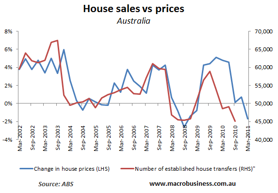
First, consider the quarterly data from the ABS:
As you can see, there appears to be a strong correlation between changes in the number of house transfers and changes in home prices, with house transfers tending to lead prices.
Now for the annual data derived from the ABS (house prices) and APM (home sales weighted by population):
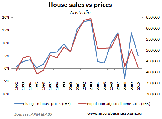
Again, there is a strong correlation, although it is unclear which variable is the leading indicator.
Now for the capital city data.
Sydney:
First, the quarterly data:
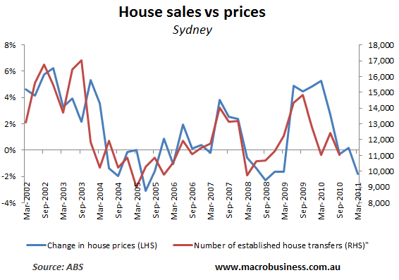
Again, there’s a strong correlation, with house transfers seemingly leading house prices.
Now the annual data:
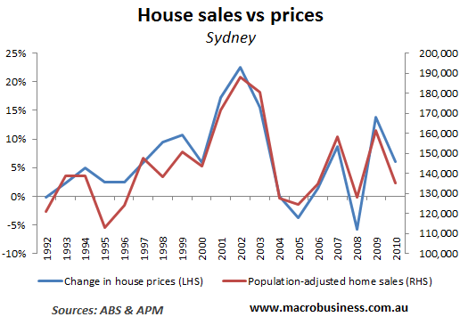
Once again, there is a strong correlation, although it is unclear which variable is leading which.
Melbourne:
First, the quarterly data:
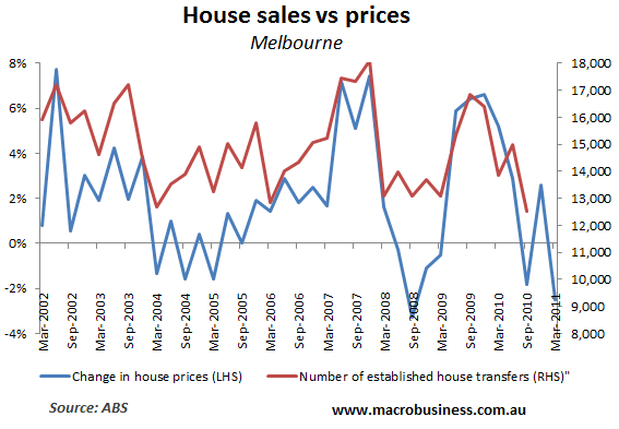
There’s a reasonable correlation for Melbourne, but not as strong as with the previous case studies.
Now the annual data:
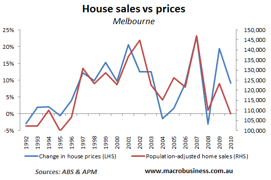
That’s more like it. The correlation is strong, but it is unclear which variable is leading.
Brisbane:
First, the quarterly data:
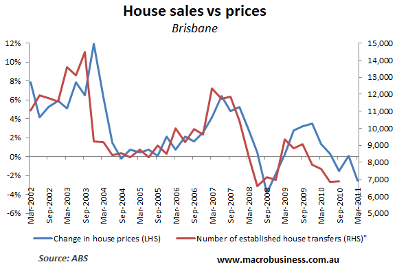
Now that’s a strong correlation, with house transfers also clearly leading house prices.
Now the annual data:
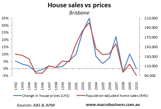
Again, a strong correlation, but with no indicator appearing to lead the other.
Perth:
First, the quarterly data:
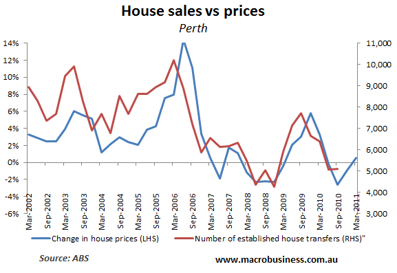
Like Brisbane, there is a strong correlation, with transfers leading house prices.
And the annual data:
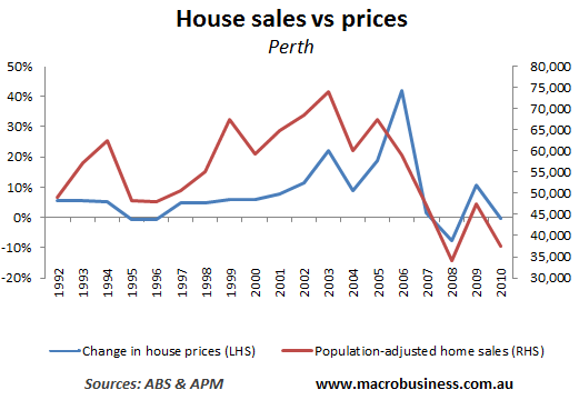
Again, a decent correlation particularly over the 2000s, with house sales appearing to lead prices.
Adelaide:
First, the quarterly data:
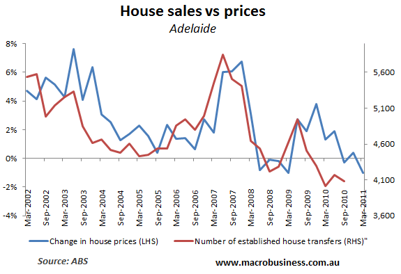
A nice correlation, with house transfers seeming to lead prices.
Now the annual data.
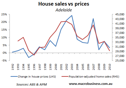
Again, a strong correlation, with home sales appearing to lead prices, particularly over the 2000s.
Conclusion:
As expected, the data shows a strong correlation between changes in house transactions (sales) and changes in house prices, thereby supporting Delusional Economic’s findings. Further, the quarterly ABS data tends to show that house transfers leads house prices, whereas the annual ABS and APM data is less conclusive, with both variables tending to move in unisen.
Later in the week, I will seek to add changes in finance commitments to the above charts. Stay tuned…
Cheers Leith

