Relying on stock market averages
In my research putting together my articles on Asset Allocation in Super, I’ve collated the data that supports the thesis that investing in Australian shares is not as lucrative as the financial industry would have you believe.
The standard industry myth is that the stock market provides 9% returns on average. I’ll quote broker Marcus Padley whose presentation last year got me thinking more in this direction:
If you just rely on the average return from the stockmarket, you are probably going to go nowhere in real terms (i.e after inflation, fees), yet there’s a whole swathe of people in my industry, advisers, brokers, financial planners who have got this idea that they genuinely believe that the average return on the stockmarket is something like 9.5%, that you’ll double your money every six years and triple it every 10…. You have to be smarter than that.
In the long run, we’re all dead
First, I’ve created a table of long term averages. That is, the average yearly return (using monthly average prices) from investing in the Australian share market since 1901, in 10 year intervals, up to 1986 and then 5 year intervals thereafter.
I’ve included the average dividend yield (could not find data before 1950, so I’ve used the average yield from 1950-2010 as a proxy), average inflation (according to the RBA, adjusted for decimilisation in 1966) and I’ve assumed – which is rarely mentioned – that you will pay 0.2% in slippage or dealing costs and on average 0.5% in financial planning and/or fund management fees. I have not taken into consideration survivorship bias, nor market entry, assuming that units in an index fund are purchased at monthly or quarterly intervals.
I also haven’t assumed tax implications, which confuses the matter in super particularly with regard to dividends and their franking credits, but this research is putting into light the “buy and hope” strategy, so tax on capital gains shouldn’t be an issue.
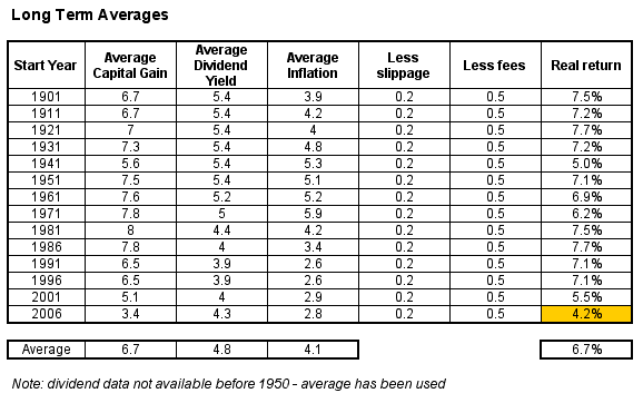
First off, the average nominal capital gain is nowhere near 9% per annum – although there has been a maximum of 49%, and a minimum of -29%. The long term average is 6.7% – and has been 5.3% since 1991.
Let me repeat that – the average nominal annual capital gain in the Australian stock market since 1991 has been less than 5.5%
Dividend hugging
Whoops – I forgot dividends, which have averaged since 1950 at 5.4% per annum, although since 1991 the average yield has only been 3.9%.
Add the two together and you are getting the much touted 9% average annual growth, so maybe I’m wrong.
But now we come to the crux of the matter – this result is before inflation and the inevitable slippage and fees charged to get access to this performance.
Inflation and taxes but I repeat myself
I’ve had to use the ABS derived Consumer Price Index, showing average annual “inflation”. Suffice to say, I think this measurement is baloney – it doesn’t really capture the reduced purchasing power of your capital, but its the only measurement we’ve got.
Using this data and a conservative assumption on slippage/dealing charges, plus fund management/financial planner fees, you can derive a pre-tax, but real average return since 1901 of 6.7% per annum. And that trend is turning down as we end this secular mega-bull market.
Remember, this includes dividends. Good, but not quite 9.5% is it?
Note that since 1981, where I’ve seen financial institutions spruik an average as high as 13%, the real return is 6.5% – and in the last 5 years its been 4.2%, including dividends (note the last cell)
Bonds, I presume
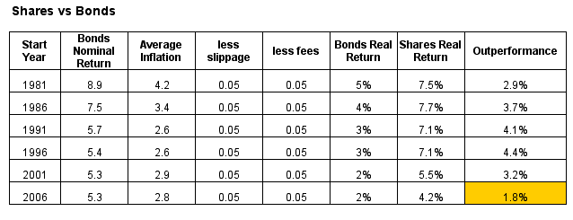
How do bonds stack up against this “performance”. Using the UBS Bond Index (data for which goes back to 1980) as a proxy, I’ve compared the two, and assumed less slippage and fees (as these are “passive” investments – most fixed interest options have very low management fees).
Obviously, bonds should not perform as highly as shares, but the outperformance is not as great as you would expect, given the substantial risk of loss of capital on the latter during any of the rolling periods, which I’ll come to shortly.
Bonds have managed a real, inflation-adjusted average annual return of 3.1% since 1981 compared to 6.5% for shares. This outperformance has reduced significantly in the last five years to only 1.8% – not a high premium. And crucially, we haven’t talked about the non-normal distributions around these “average” returns yet.
Rolling, rolling, rolling
Observing how markets perform over the very long term is interesting academically, but what about rolling periods that capture the volatility that is smoothed out by the averages?
Q Continuum made a point in his post on sideways markets that share markets move sideways, up and down, each about one third of the time. In some cases however, this sideways movement can last years or a decade. Note that the S&P500 US Share market moved sideways, from 1969 to 1982. Our market behaved in a similar fashion.
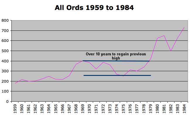
Note that there was another similar period in the 1950’s, after the post-WW2 euphoria ended, and over 5 years of zero nominal gains set in. Pundits may well point to the succeeding years of high double digit rises in stock market values, but fail to point out the commensurate rise in inflation.
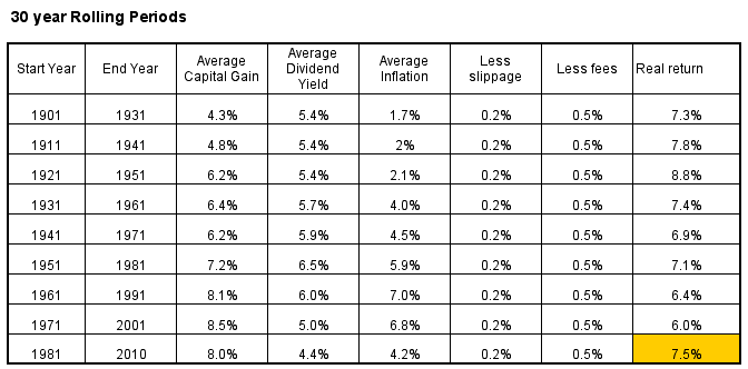
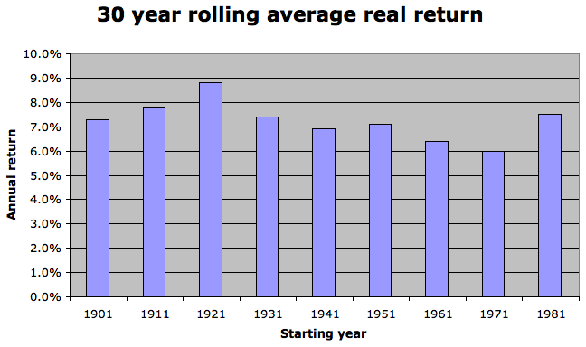
The table above shows a period of 30 year rolling timeframes, similar to what a new superannuant would be exposed to in building their “savings”. Note how average inflation has been increasing over time, shadowing the increased “returns” of the sharemarket, whilst average dividends are falling.
The last 30 year period (1981 to 2010) has been one of the best performing in Australian history, mainly due to the bubble in stocks from 2003 to 2007, but the larger or secular trend has been obvious since the end of the decade long stagnation in stocks in 1982. During that period it was a reliance on dividends pushed by inflationary pressures that kept stock holders in the black.
Summary
I hope this small study of share market averages will give you an idea where we stand from an historically viewpoint. To summarise:
- the average real return of the Australian stock market, after inflation, before tax is 6.7% per annum since 1901
- the average annual dividend yield since 1950 is 4.8% and is declining
- the average premium of stocks over bonds is 3.3% per annum since 1981 and is converging
- the average nominal annual capital gain in the Australian stock market since 1991 has been less than 5.5%
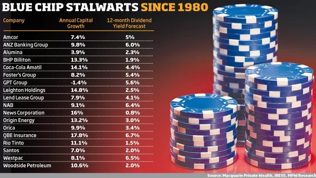
This isn’t the complete picture, as this illustrates the potential returns available from the stock market, given some fairly conservative assumptions (e.g low fees, slippage and non-discretionary timing of entry, and most important – no effect from taxation and survivorship bias). It also doesn’t show the true potential and comparison with individual stocks, which can achieve many multiples of the averages above. Even some standout blue chips that comprise the index can outperform the average handsomely.
