The rampaging golden bull
With gold almost rising to a new all time high in USD per ounce (Europeans get that tag for today) it’s time for another close look at the shiny metal. This will be a technical and chart heavy look at gold from a fractal viewpoint – i.e from the very long term (secular), then long term (cyclical), medium term and finally the “noise”.
Monthly Charts
Where does gold stand, in mid 2011, in historical terms? As the first chart below shows, gold experienced a bear market from 1996 to 2004, trading below $400 USD an ounce.
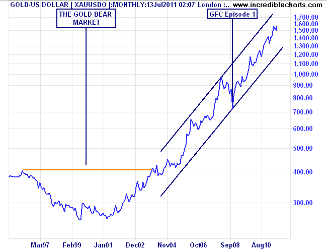
Since 2004, or more rightly, 2001 (which was also the beginning of the Euro and US secular bear stock markets), gold has been in a major bull market, with the monthly price inexorably rising within a contained trend channel.
Compared to the gold bubble of the 1970’s, the current price is not (yet) running away.
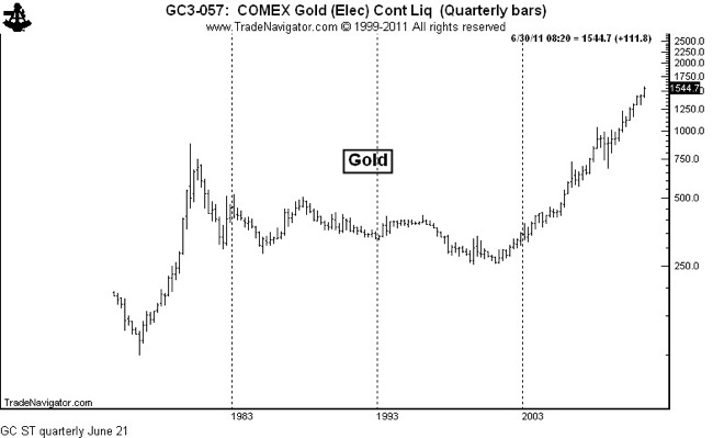
Quarterly chart of gold - note the parabolic rise in the '70's compared to the straight trend of this decade
Zooming in to a six year timeframe provides a closer look and captures the start and finish of bull and bear markets.
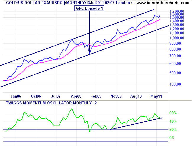
I’ve added my preferred indicators to this chart:
- weighted 260 day moving average (pink line)
- 12 month Twiggs Momentum Oscillator (bottom panel)
A rising 260 WMA indicates a bull market – note how this was punctured by the monthly price during GFC Episode 1 as gold fell from nearly $1000 USD an ounce to just over $700. The 12 month TMO measures the rate of change in price – a reading above 20% is a sustained bull market.
Current activity is clearly bullish and has been since the 2009 lows, with sustained momentum (notice rising trendline).
Weekly Charts
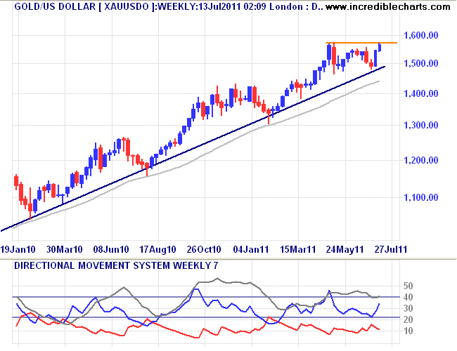
Zooming in to 1.5 years using weekly candlestick charts (the candle “body” is the open and close, the “wicks” are the extreme highs and lows. A blue candle means an up-week, a red candle and down-week) I’ve drawn a trendline from the low of the correction in gold in 2009.
Note how the weekly price has touched this trendline of four separate occasions, indicating there is a cyclical element to the ongoing bull market, with a reversion to the mean (the main trendline) when prices become frothy. The run up due to the announcement and subsequent implementation of QE2 is clearly evident, with a stall in prices as The Bernank turned off the (electronic) presses at the end of June.
Gold reached a new high (noted with the horizontal orange line), in early May, which is now being “threatened” as the whiff of QE3 is in the air.
A technical look at this recent action re-introduces the 260 day WMA (grey line) and my favourite secondary trending indicator, the Directional Movement System. In plain English, the DMS comprises 3 lines – the blue represents the strength of positive direction, the red negative, and the grey line is an index reading of direction itself (called the ADX).
The current reading is clearly bullish and rising, but not as strong as recent “take-offs” in February this year, or August 2010. A breakout above the recent historic high with an uptick in the ADX (the grey line) provides a very bullish case to a new rally in gold.
Daily Charts
Finally, the daily charts – representing the ongoing battle between those trading the “noise” of the market.
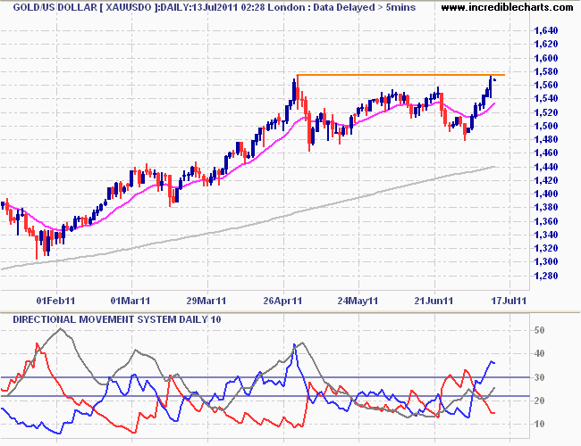
Here I’m using daily candlesticks, with a 15 day moving average smoothing out the intra-day trading action (pink line), with the 260 day WMA below (grey line). The horizontal orange line representing the intra-day high of $1575 on May 2 shows how the recent price activity is JUST below. In trading terms, this is called resistance – a ceiling to which prices try to break through (the inverse is support, a “floor” on prices).
The 10 day Directional Movement System shows the bulls are in control (rising blue line) with directional strength rising (rising grey line). Again, more evidence of a bullish bias continuing.
Patterns
A note on patterns: if the gold price does not CLOSE above this resistance line, a double-top formation will occur. Note in the weekly chart above how gold has a propensity to form double- or triple-tops as traders try to push the shiny metal to a new higher level, but are rebuffed (I’ll let the conspiracy theorists try to explain why). These “failures of resistance” can turn the market around and since 2009 have provided savvy gold-buyers an opportunity to load up when the price falls to support – the weekly trendline or the 260 day WMA.
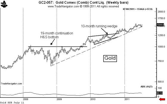
Having said that, my favourite commodity trader, Peter L.Brandt– who only trades patterns (I use technicals only, others use macro/fundamental analysis), notes 2 patterns to consider.
The weekly graph displays the sustained bull trend in Gold. This trend remains intact.
The daily graph displays a clearly defined 10-week symmetrical triangle. This pattern should be bracketed in the December contract with buy stops above 1565.1 (intraday) or 1556.1 (close); and with sell stops at 1476.4 (intraday) or 1486.4 (close).
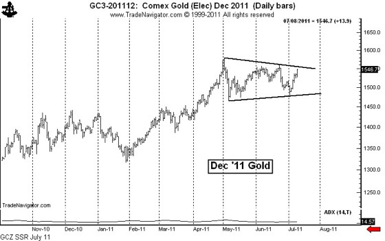
What Peter is saying is a variation on the resistance break theory: traders are likely to go long gold if it breaks to the upside at $1565 (during the day) or closes above $1556. I would prefer to see a close above $1575 for a sustained trend. Note that Peter is also cautioning a break to the downside – which could occur if the US debt ceiling ruckus is not resolved (or any number of ongoing crises in the Twilight Zone, err, EuroZone)
Targets
If gold continues its long term secular bull market, the target for the end of 2011 is approx. $1600 to $1700 USD an ounce. A rally on the back of QE3 could reach the upper side of $1700 (depending on the size of the QE’ing), although I agree with Peter that the likely target is approx. $1650 or so.I prefer not to set targets, as I trade with the trend, but its also worth noting that any liquidity crisis and subsequent US dollar rally (e.g GFC Episode 2 – the Debt Strikes Back) could see gold drop to $1300 or less, in a similar scale to its fall from grace during GFC 1.0
