Yes OK, I know I said I was giving up on AFG last month, but after I posted that piece two readers, Merovingian and Peter Fraser, gave me some feedback that suggested I should take another look at the data to compare its trend with data that is released by the ABS.
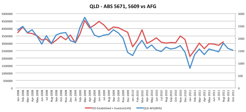
So I took some time over the last month to build up some charts comparing the historical AFG data with data from the ABS 5609 and 5671 datasets in order to determine if the trend from the AFG data matches that from the ABS. The reason to do this is because the AFG data is released 6-8 weeks before the ABS data appears and therefore if it is determined that the AFG data is trustworthy in terms of trend then it may be a reliable source to judge how the housing market is doing well in advance of the actual data releases from lending institutions through the ABS.
For those who haven’t followed my previous episodes with the AFG data, I am a little hesitant about its reliability because of a unreported data revisions that occurred back in July this year and also because this data is raw and therefore does not compensate for seasonal adjustments or changes in the market share of AFG.
But, as I said above, I took some readers advice and gave AFG the benefit of the doubt… So to the charts…
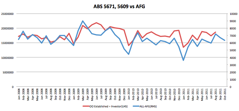
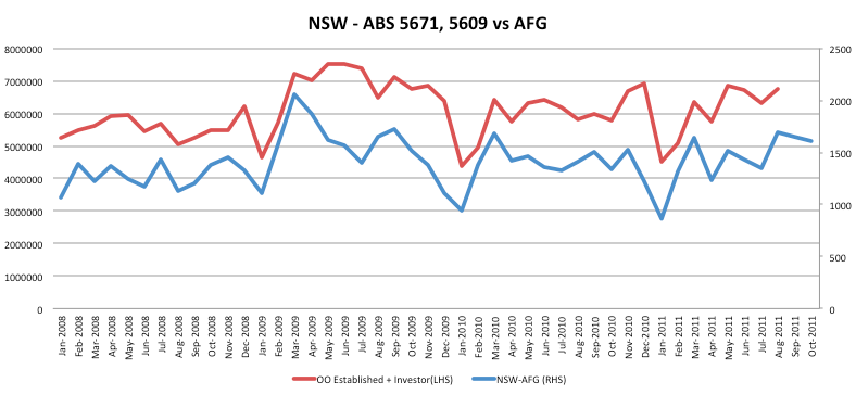
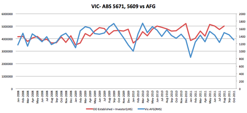
The following are comparison of the AFG loan volumes issued for each month against the issuance of credit to owner occupiers for existing houses(ABS 5609) and investors(ABS 5671).
Firstly, at a national level: (Click for larger image)
For New South Wales:(Click for larger image)
For Victoria:(Click for larger image)
For Queensland:(Click for larger image)
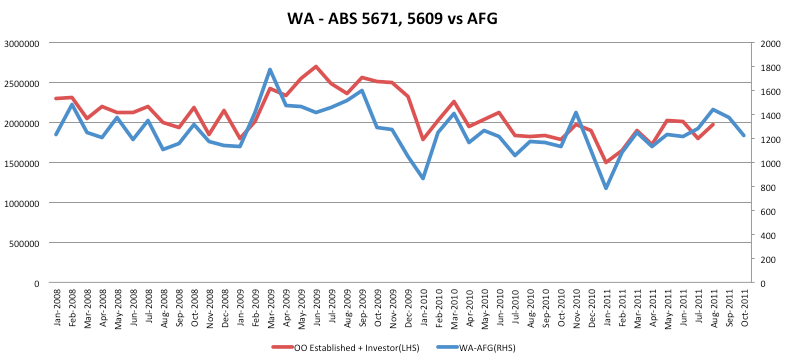
And finally, for Western Australia:(Click for larger image)
So it would seem , except for a brief period in mid-2009, that the AFG data is actually a fairly good leading indicator for the trend in credit issuance towards housing. That being the case I must admit that I was wrong, and thanks to Merovingian and Peter I will be adding the AFG data back into my toolkit. Having said that, I am still hesitant to trust some of the qualitative data due to my previously stated caveats and also because I think the sample size for some of the groupings in the data is a little too small. However, having run through the exercise it does seem to be the case that the AFG dataset is a fairly good leading indicator of where the housing market is heading.
Given this, it looks as though the next two months of data from the ABS is going to be negative, with some stabilisation in NSW and VIC and further deterioration across WA and QLD. Obviously this is only demand-side data and you will also need to reference supply statistics to get the whole picture across each state. This is especially important for Victoria where it appears supply has gone mad.
The latest report from AFG was published yesterday and according to them we are seeing a return of the first home buyer. As I said above I am a little hesitant about reading too much into this data, but it does suggests that lower prices and/or the expectation of lower interest rates has stimulated lower end demand.
First Home Buyers are returning to the market in greater numbers than at any time since September 2009, according to AFG, Australia’s largest mortgage broker. The AFG Mortgage Index shows that First Home Buyers comprised 16.4% of all loans processed – a 40% increase for this buyer category compared to October 2010 when they comprised 11.8% of the mortgage market.
First Home Buyers were particularly active in NSW, where 21.1% of home loans were arranged for them in October, as well as QLD (17.9%) and WA (17.3%).
The full report is below.
