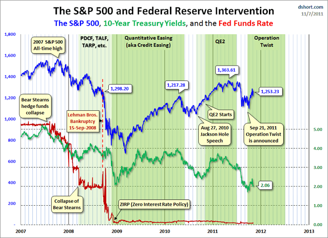
Continuing our series of charts on the US S&P500 stock index, is today’s from Doug Short, plotting the US Federal Reserve’s (the Fed) intervention via the Fed Funds Rate and other programs that has arguably sustained asset prices.

The intervention has been a series of programs, emergency at first (TARP, TALF etc), then a series of Quantitative Easing (QE) – or “milky wilkies” – note the green bands in the chart indicating QE 1, QE 1.5 and QE2, and the latest “Operation Twist”.
Every series of QE has resulted in a major boost to the S&P500, and through correlation with other risk assets, asset prices around the world including the ASX200. This is no conspiracy – it has been openly stated by the Fed that that is one of the primary purposes of the credit swap program, to enhance liquidity and increase asset prices.
Unfortunately, the result is an expectation that the Fed has run out of bullets. The reality is untrue – the Fed has a Hollywood-style magazine – an unlimited supply of funds to do what it wants (perhaps buying up all the underwater mortgages might help??)
The Fed Funds Rate (similar to the RBA Overnight Cash Rate) is nearly zero – a so-called Zero Interest Rate Policy or ZIRP – and 10 year Treasury Bonds are yielding just over 2% and it seems they are on their way to a Japanese 1% level, although Operation Twist is trying to avert that.
The results of these policies, best said by Doug Short:
The past three years have been an exciting time for many professional traders and their seasoned amateur counterparts. And it’s been a dream-come-true for institutional HFT (high frequency trading) with computerized algorithms….
On the other hand, savers — those benighted souls looking for income from CDs, Treasury yields, and FDIC insured money markets — have had a rude introduction to the new reality, one that will apparently be with us for a very long time.