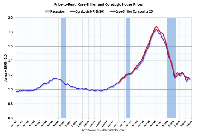
Today’s chart comes from Calculated Risk as the S&P/Case-Shiller Home Price Indices were updated for September 2011 overnight (direct source here).
There are 3 charts derived from the Case-Shiller data, nominal and real house prices and the house prices to rent ratio. The latter is the most interesting, in my opinion, as housing costs (purchase or rent) revert to their mean, now back to June 2000 levels, but still above the post 1987 bubble level:

Advertisement