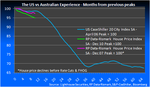
Back by popular demand, here is my chart on the respective rates of decline for Australian housing now versus the 2008 experience (which obviously reversed) and the US experience in the GFC. Obviously this is a limited sample and is not intended to suggest that local housing is on the same path as the US. It is about gauging the relative speeds of correction:
