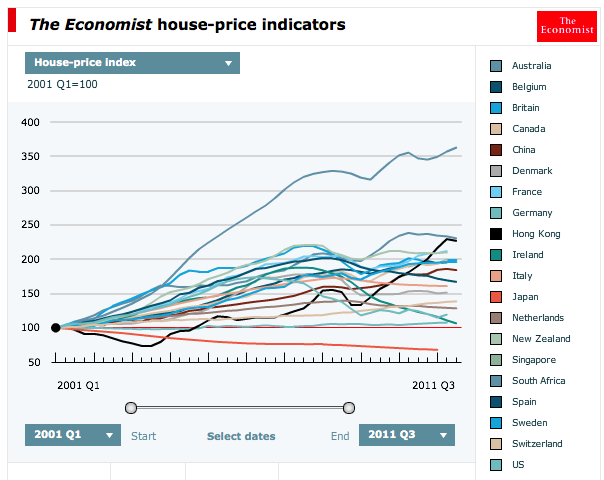
The Economist has released its annual house price survey and on most measures Australia remains in the top category for most overvalued. I’ve extracted some charts from the interactive graphics to give you an idea of The Economist’s guide to relative merits. First, a straight comparison of house prices:

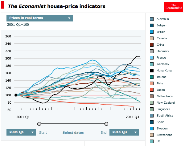
Australia comes in second behind one wildly expensive South Africa. On prices in real terms we also come in second:

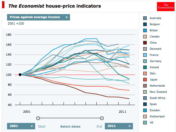
On price against average income we come in at a more respectable 4th or 5th, with recent years strong income growth making a dent:

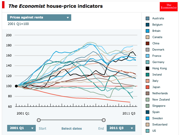
On price to rent we come in fifth, again benefiting from recent years strong rental growth, which has now stalled:

The point of this post is not to question the methodology. It’s the same for everyone so if offers a useful guide to relative value. These charts say to me that Australia actually has two problems, not one. First, we have a housing bubble. Second, we have an incredibly expensive country generally that means we are in no way competitive on anything beyond historically overpriced dirt.

