The majority of reporting by the Australian financial media and associated economist punditry, focuses almost solely on a quarterly snapshot of growth in Gross Domestic Product (GDP). This is usually done in scattergun fashion, alongside a raucous display of big numbers on capital expenditure or other cherry picked data, then annualised into the beyond.
What is missing of course is how the growth in the economy effects each Australian, best measured by the change in real (adjusted for inflation) GDP per capita. As we’ll see soon, this strips away the inflated effects of population growth, stimulus packages and other economic chicanery.
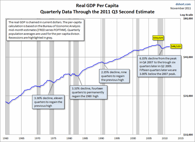
As seen in the US Chart below from Doug Short’s blog, the US economic “recovery” as measured by US GDP per capita is still 3% below Q4 2007 levels, falling from $50,020 to $48,520 in real terms:
As I said in my Chart of the Day post recently:
… US GDP (growth) is only being held up at ca. 2% p.a because of massive (10% of GDP) government deficit spending. That spending will be cut in FY2012/13 automatically, and may even be slashed further on the outside chance a Republican candidate wins the election against incumbent Barack Obama.
You may recall that the US government and US Federal Reserve have spent (and created) a little bit of money between these two periods, whilst cutting the cost of borrowing an unlimited amount of money for the banks to zero, forestalling what could have been a Depression.
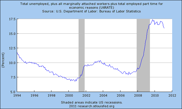
This puts their “recovery” in a better light, as unemployment (as measured more broadly by the U6 measure) remains at 16% having been 8% previously:
For the Australian economy, I’ve created 4 charts, using the ABS National Accounts data to provide a comparison.
First, here is the whole data series of real GDP per capita, from September 1973 to September 2011, showing the inexorable growth of the Australian economy:
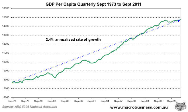
The trend rate over the entire period was 2.42% per annum.
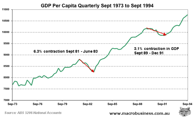
Second, I’ve zoomed in on the last 2 recessions, to provide some context of where we are today. Real GDP per capita contracted over 6% peak to trough 1981-1983 and just over 3% in 1989-1993:
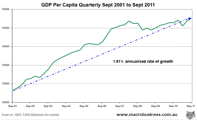
The third chart plots the last 10 years where the trend growth was 1.5% per annum:
The fourth and final chart highlights the GFC up to the current period, but before having a close look, let’s go over what occurred following March 2008, where GDP per capita peaked at $58744 (or $14686 per quarter). The Australian economy had the following stimuli in the wake of the GFC:
- 1.2 million or 5.7% increase in population
- $270 billion increase in housing debt
- $42 billion in government stimulus
- 300 basis point (3%) reduction in cash rate (total 400 points peak to trough)
The outcome? A 0.53% increase in GDP per capita, to $59,060 (or $14,765 per quarter) over 3.5 years.
Half a percent…over 14 quarters. Annualise that and its barely statistically perceptible. Measured against the trend rate over the last 10 years of 1.5% growth per annum, and its nowhere near trend.
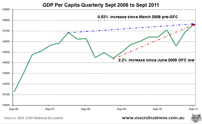
However, as you can see from the chart, if we measure from trough to peak, the result is more obvious – a 2.2% increase from the June 2009 quarter to September 2011 quarter, but the outcome is the same. An annualised trend rate of growth of 0.98%, substantially less than the long term rate of 1.5% over the last ten years, or the 2.4% rate over the whole data series.
With a government forced to return to surplus to maintain its AAA rating and thus reduce stimulus spending, credit growth running at 30 year lows and decelerating, a slowdown and likely reversal in Terms of Trade from record high commodity prices and in the absence of further Chinese stimulus (which arguably did more than all the endogenous stimuli outlined above), its hard to see how GDP growth can return to the mean trend of pre-GFC years.
