The Australian Bureau of Statistics (ABS) yesterday released the Australian Demographic Statistics for the June Quarter 2011. Below are a series of charts summarising the key trends relating to Australia’s population growth.
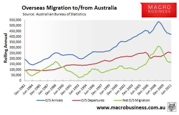
First, a chart showing net overseas migration (NOM), which measures in/out migration of anyone residing/leaving Australia for a period of 12 months or more (rather than permanently). As you can see, NOM is still above long-term trends, but has declined sharply from the peak level seen in the year to September 2008, from around 315,000 to 170,000 annually:

The fall in NOM is due, primarily, to a reduction of overseas arrivals to Australia.
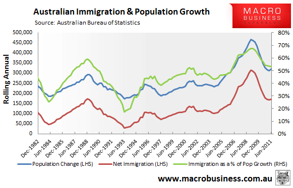
With the decline in NOM, Australia’s population growth has also fallen significantly, from a peak of just under 470,000 in the year to September 2008 to just over 320,000. The share of population growth coming from immigration has also fallen over the same period from a peak of 67% to 53%:

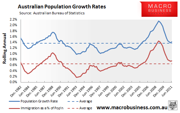
Finally, in percentage terms, it appears that Australia’s population growth and immigration are returning to average levels after surging in the 3 years to 2008:

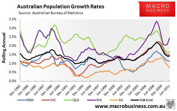
At the state level, it’s all about mining. Western Australia is leading the way, experiencing 2.4% population growth in the year to June 2011. This is followed by Queensland (1.7%) and Victoria (1.5%), which are just above the national average (1.4%), with New South Wales (1.1%) and South Australia (0.8%) bringing up the rear:

So there you have it – four charts summarising Australia’s population growth.
My guess is that Australian immigration levels, and by extension population growth, will remain at or above average levels as long as the mining boom is in play.
unconventionaleconomist@hotmail.com

