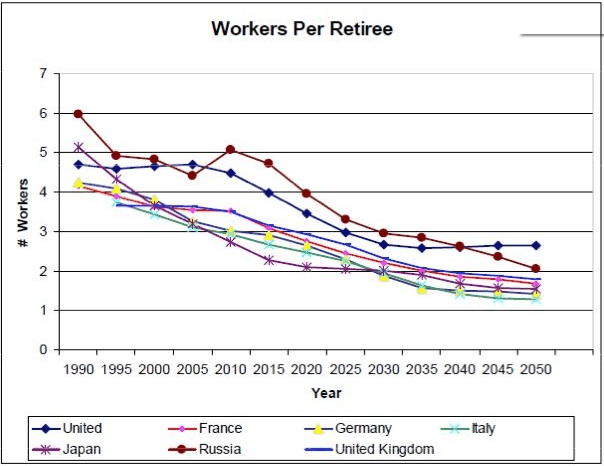
The chart nicely summarises the population ageing dilemma facing much of the world, whereby economies are likely to face sharply slowing economies, lower taxation receipts, higher aged care expenditures, and greater debt burdens for decades to come.
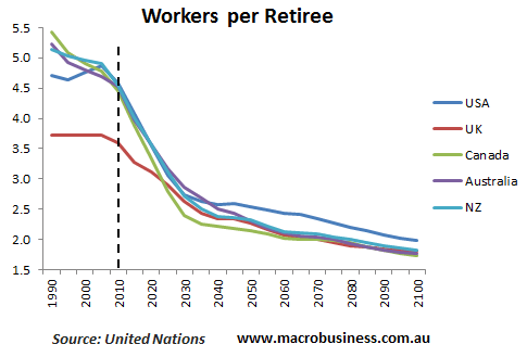
For readers interested in seeing how Australia compares on these metrics, I’ve created some comparable charts of the ratio of retirees per worker in the Anglospehere nations. For the purpose of this analysis, someone is considered retired once they reach 65 years of age.

As you can see, Australia, New Zealand, Canada and the US are all expected to experience similar levels of population ageing.
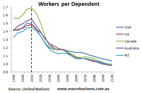
Now consider the below chart showing the projected number of workers per dependent. For the purpose of this analysis, a dependent is someone aged 0 to 19 or 65 plus.

As you can see, the number of workers per dependent appears to have peaked and is now projected to fall sharply from here in line with the coming retirement of the Baby Boomer generation.
Whichever way you cut it, the world’s demographics have turned negative, and are likely to create strong headwinds for economies and asset prices going forward.


