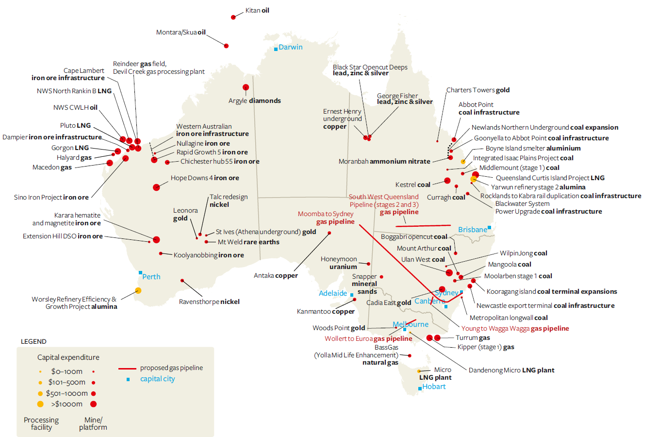
I was doing a little ABARE report reading recently and came across these two images which show just how big the Australian mining boom is and how much pace it is gathering. The first is a graphical showing the major development projects in Australia as of October 2010 (full report here).

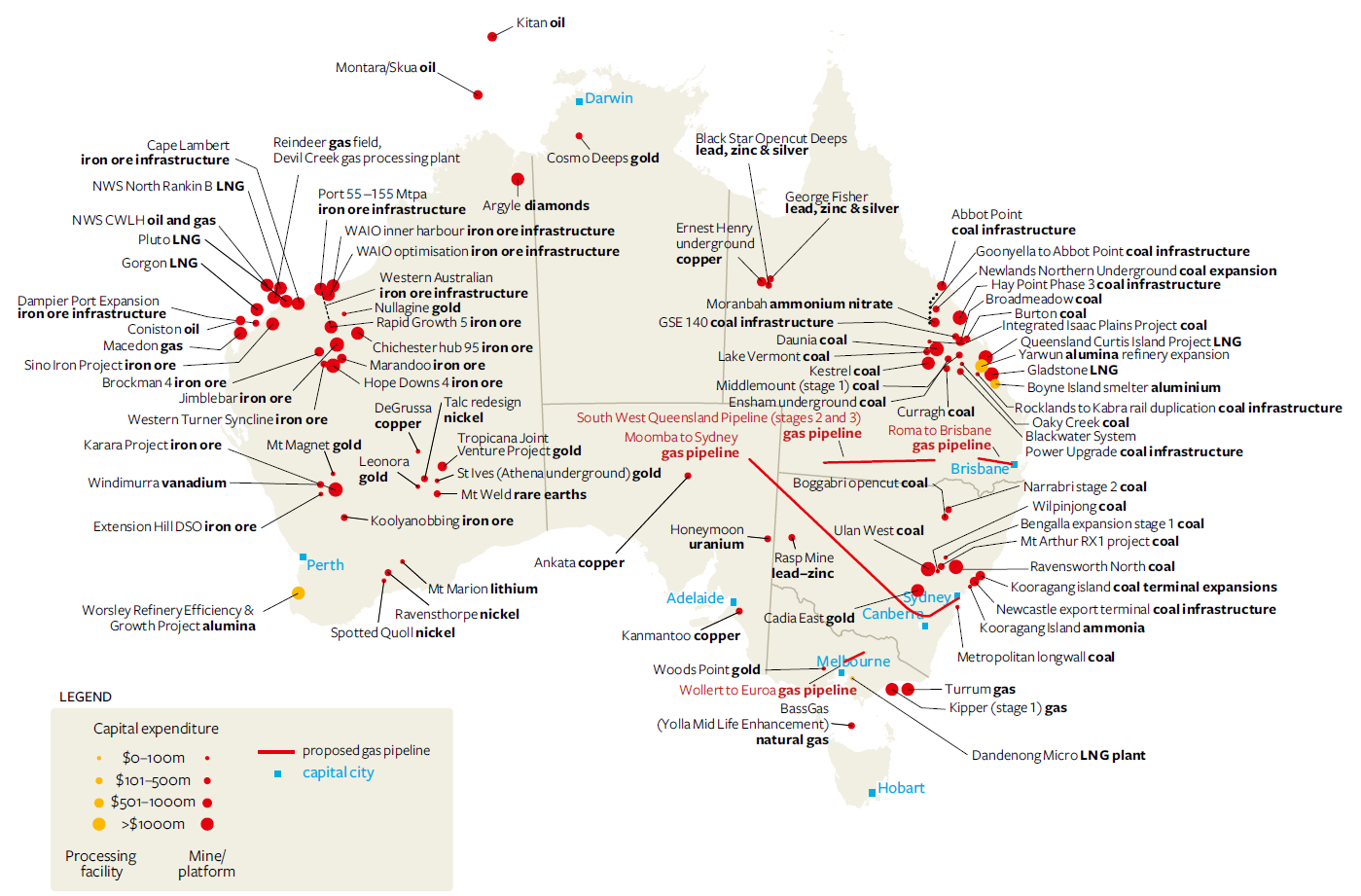
The second image is the same graph contained in the April 2011 Major Development Projects report (6 months later).

You can easily see the number of red dots has increased in that small time frame. The total value of all advanced projects (those committed or under construction) increased from $133 billion to $174 billion. That’s a $40 billion increase (or 30%) in the space of 6 months. In additon, the increase has been happening in all sectors – energy, minerals, infrastructure and processing facilities.
With ever-increasing numbers like that flying around it’s easier to understand the RBA’s hawkish rhetoric last year – especially given Australia’s previous expereince with mining booms. I would have been a scared Guv’nor too. However, the RBA didn’t count on the effects of a massive consumer debt hangover because, much like this mining boom, we’ve never had one so big before.