Chart of the Day: long term bond returns
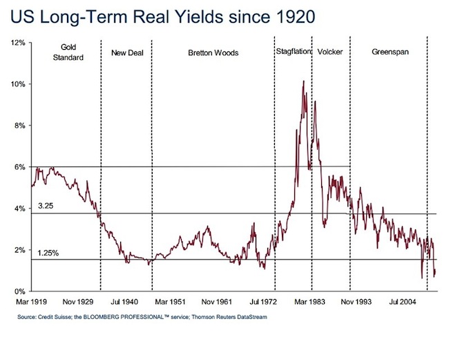
With the debate still on if we are seeing the end of the US bond “bubble”, here’s a relevant chart from Bianco Research vis The Big Picture:
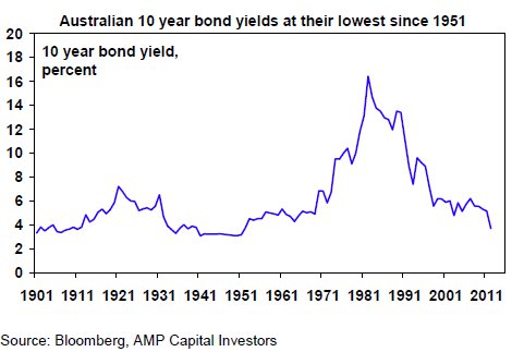
 And here’s the Australian version:
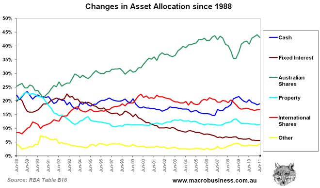
 There is a valid argument that it has been the demand for bonds over the last 20 years that has driven the prices up and yields down. However, the allocation since that time has gone the other way, at least for Australian fund managers, who are slavishly devoted to shares, as I revealed here last year:
An examination of the managed fund industry’s change in asset allocation over time is illustrative. Consider that since 1988 (when earliest data is available), the industry has gone from a 25% exposure to Australian shares to a 43% exposure:

Will we see a reversal in allocation just at the same time bond yields start to climb? Or is the secular bond market going to accelerate as the RBA likely accelerates the easing cycle?
