Just before Christmas, I bemoaned the state of economic reporting by the Australian financial media and associated economist punditry, which seemed to be stuck in either “permabull” or “permabear” status. Whenever the quarterly Gross Domestic Product (GDP) figures come along, like they did today, the former status is usually supplied with a “raucous display of big numbers on capital expenditure or other cherry picked data, then annualised to infinity and beyond”.
Apart from the peripheral extreme pundits, and the notable exclusion of Westpac’s chief economist Bill Evans, there has been a mea culpa today as the headline figure – 0.4% quarterly and 2.3% over the year – came in as disappointing and not in line with most economic models. Except here at MacroBusiness.
Why? Because we look at the real economic growth – adjusted for inflation and population – and the underlying causes thereof, namely government spending and credit growth. This methodology strips away the inflated effects of population growth, stimulus packages and other economic chicanery.
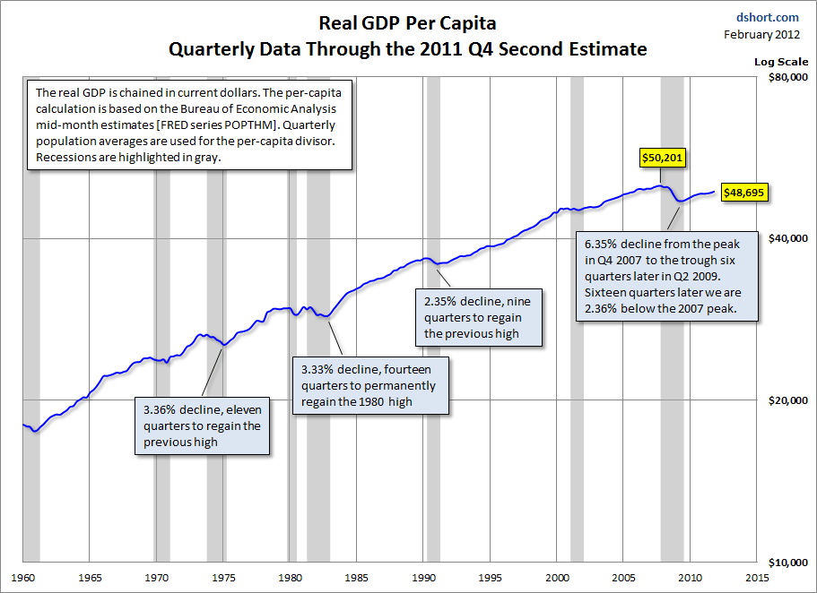
First, let’s have at look at this measure using the USA as a reference. As seen in the below from Doug Short’s blog, the US economic “recovery” as measured by US GDP per capita is still 3% below Q4 2007 levels, falling from $50,020 to $48,520 in real terms:
Aussie! Aussie. Aussie?
For the Australian economy, I’ve created 4 charts, using the ABS National Accounts data calculating real GDP per capita:
First, here is the whole data series of real GDP per capita, from September 1973 to December 2011, showing the inexorable growth of the Australian economy:
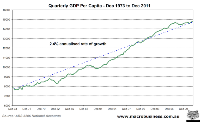 The trend rate over the entire period was 2.4% per annum.
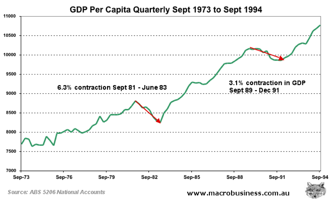
 Second, I’ve zoomed in on the last 2 recessions, to provide some context of where we are today. Real GDP per capita contracted over 6% peak to trough 1981-1983 and just over 3% in 1989-1993:
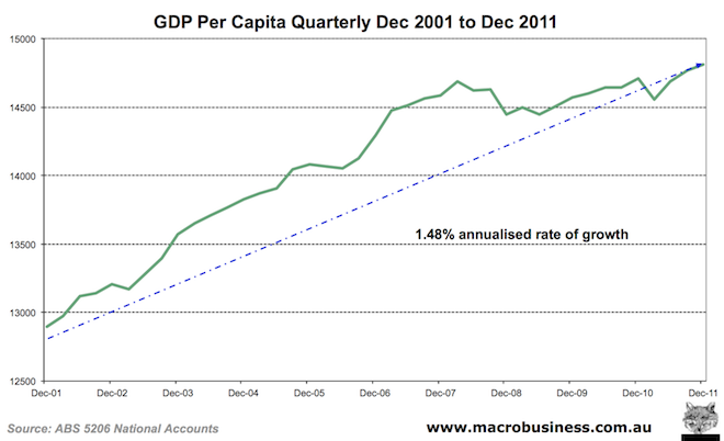
The third chart plots the last 10 years where the trend growth was 1.48% per annum:
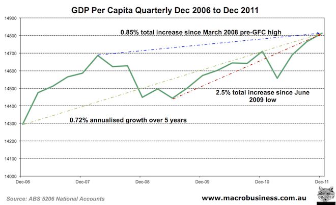
 The fourth and final chart highlights the previous 5 years, encompassing the GFC and up to the December 2011 quarter period, where GDP per capita peaked in March 2008, bottomed in June 2009:
 The outcome over 5 years? Trend growth at 0.72% per annum, with peak to trough and current total growth as marked on the chart.
Over the last 12 months, yearly GDP per capita growth was at 0.7% – substantially less than the long term rate of 1.48% over the last ten years, or the 2.4% rate over the whole data series.
The Australian economy is still growing, but at half the long term pace on a person by person basis, and given the problems with the standard CPI measurement (which contrary to popular belief, does not measure inflation), it is likely that purchasing power is not being maintained either.
With a government forced to return to surplus to maintain its AAA rating and thus reduce stimulus spending, credit growth running at 35 year lows and decelerating, a slowdown and likely reversal in Terms of Trade from record high commodity prices and in the absence of further Chinese stimulus (which arguably did more than all the endogenous stimuli post GFC), its hard to see how GDP growth can return to the mean trend of pre-GFC years.
It’s also hard to see how this is surprising.
