Chart of the Day: inflation shock
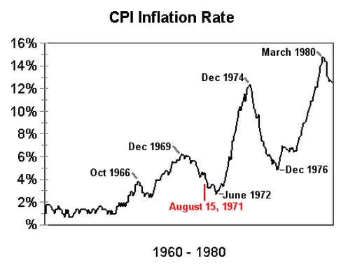
Today’s chart comes via History Squared, and shows the pace of inflation in the last monetary crisis, when the US moved from a declining gold bullion system to a fiat, or modern monetary system. The decline was during the 1960’s as the Vietnam War, apart from its colossal human toll, also took a large toll on confidence in the US Dollar, as deficit spending ran out of control, which eroded the international community’s faith in the “gold” standard, and imbibed an inflation surge (matched by stocks by the way):

The red note marked on the chart is when President Nixon announced the move off the gold bullion standard (with the US dollar pegged at $35 per ounce of gold), with other callouts representing high and low points.
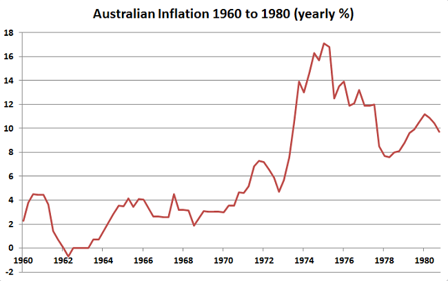
Here’s the Australian change in inflation, as measured by the ABS CPI(consumer price index) over the same period:

For reference, what happened from 1980-2011 (also the largest stock market boom in history), where inflation averaged 4.4%, not the 6.2% of the previous 20 years:

Where are we headed next? Inflation or deflation. This is probably the biggest macro question out there – the classic known unknown.