Even though more words have been written about Australia’s productivity performance than most other economic issues, I have learnt very little about what our productivity trends really mean.
Recently, the RBA tried to unravel the mystery. Here at MacroBusiness my wise colleagues have often penned their interpretation of events.
To throw a little more confusion into the mix, the RBA’s D’Arcy and Gustafsson note that:
…there is considerable measurement error in the estimates of productivity growth making it difficult to be precise about the timing of changes in the underlying trend; and productivity growth is the result of the interaction of many fundamental and proximate factors.
Technological, structural and regulatory changes, as well as cyclical variation in factor utilisation, can all affect measured productivity, making it very difficult to identify and disentangle the various effects.
But we are given a hint at the important conceptual basis of the thing we refer to as productivity:
Conceptually, economists often view technology as determining the productivity ‘frontier’; that is, the maximum amount that could be produced with given inputs.
Factors affecting how production is organised, including policies affecting how efficiently labour, capital and fixed resources are allocated and employed within the economy, determine how close the economy is to the frontier.
Trend productivity growth is then determined by the rate at which new technologies become available – how fast the frontier is expanding – and the rate of improvement in efficiency – how fast the economy is approaching the frontier.
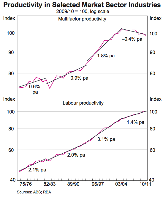
It all sounds very theoretical, but the reality actually very simple. The chart below shows the two key measures of productivity since the 1970s, and the declining multifactor productivity (MFP) that has attracted so much attention. Labour productivity has remained positive, if a little lower than the historical average:

There are two questions I will answer in this article:
- Why has is labour productivity growth historically low?
- Why has MFP growth been negative for the past decade?
To answer the first question we need some perspective about whether Australia’s performance is abnormal compared to other nations. If not, then I suggest there is little that can, or should, be done.
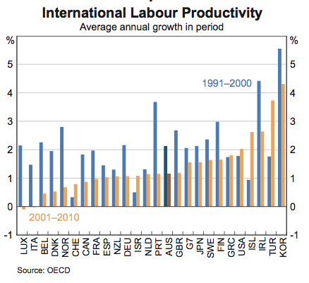
The Productivity Commission has some good figures on our performance against other comparable nations. It seems that our productivity performance is… wait for it… actually pretty good, and fairly stable in relation to the US and EU. Comparing GDP per hour worked, the fundamental measure of labour productivity, Australia has made gains on the EU15 during the 2000s, and has lost just a little ground against the US up to 2007. The chart from the RBA below clearly shows that we were middle of the road of productivity growth in global terms:

So why then would labour productivity be historically low across the world? Mostly, it has to do with significant structural declines in unemployment. Typically the least productive people, those with few skills to utilise capital effectively – to ‘leverage’ their work with the help of machines, computers, tools and so on – are the last to be employed during periods of strong growth, and the first to lose work during economic contractions. Thus the expected outcome is that during economic boom periods of declining unemployment, labour productivity will be biased down by these new workers, compared to if unemployment was flat. We should also expect that during periods of increasing unemployment, that labour productivity surges again. When the least useful one percent of the workforce is laid off, production usually declines just a fraction of that one percent.
In addition, much of the mainstream productivity discussion is dominated by the influence of mining and infrastructure, the two industries with the largest declines in productivity. The basic arguments are as follows:
- As widely noted, we have a ‘wall of wire’ problem in much of our basic infrastructure. This simply means that the honeymoon period of relatively new electrical, phone, water, and waste infrastructure is over, and major maintenance and capital expenditure is becoming more frequently required to deliver the same service.
- In mining, a sector showing substantial productivity declines in recent years, we have the situation where “rising minerals prices meant low-productive mines were profitable, and thus the extraction of minerals from those mines actually assisted in lowering the sector’s and the economy’s productivity”
These arguments are both true and apply to those sectors in terms of both labour productivity and MFP. Another major factor is unpredictable seasonal changes in the agricultural sector output.
So what of our MFP performance?
If we have been tracking fine in terms of labour productivity, the actual only meaningful and useful productivity measure that reflects the benefits from economic growth, why the dismal pattern of MFP, the measure most economists prefer to fuss over? And why do they prefer it anyway, when labour productivity is the only one that matters?
As noted in the RBA report, economists believe that Total Factor Productivity (TFP), or Multi-factor Productivity (MFP), measures changes in technology and market structure that enables the ‘production frontier’ to shift outwards. But when the idea of MFP was originally put forward, it was known as the Solow Residual, because it is “the part of growth that cannot be explained through capital accumulation or the accumulation of other traditional factors, such as land or labor”. Essentially, it is the bit left over after we measure all the inputs and outputs of the economy. Economists thought they might call it ‘technology’ or ‘productivity’, because it appears to measure our ability to get something for nothing.
But in reality, it is capital accumulation that almost exclusively improves labour productivity, and the scale of our per capita productive capacity. Having more, and better, machinery, buildings, infrastructure networks and other capital equipment, is what enables each person to be more productive. Using better machines, for example, can improve how many meters of road can be laid by a small team of workers in one day, and the quality and durability of the resulting surface. As the economy accumulates capital, all parts of production require less labour per output. It is one of the main reasons the agricultural sector requires such a small workforce. If I haven’t repeated myself enough already, it is capital accumulation that explains almost all the improvement in labour productivity (for example, see here).
To recap, labour productivity is simply a measure of output, usually GDP, divided by labour input, either in per employed person, per working hour, or per capita. MFP is a measure of output divided by the sum of inputs of labour and capital, including land. I use the term productivity to mean MFP, or will explicitly state labour productivity when referring to it.
To answer the question of why we have experience declining MFP, we have to think about what can cause a divergence between the two productivity measures. MFP is the result of dividing output, measured by GDP, by the sum of labour and capital inputs. So either we are using our capital less efficiently, requiring more new capital for each improvement in output (diminishing returns to capital), or we have some kind of measurement anomaly in the estimation of the balance of capital assets. Indeed there may be some diminishing returns to capital effect, but after investigating this anomaly I found that falling MFP is substantially the result of estimates of land prices in the measure of the capital stock.
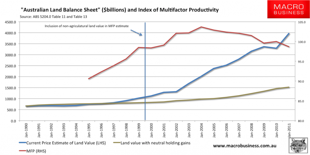
The culprit is hidden deep in the ABS release 5204.0 System of National Accounts. Back in 1999 the methodology for estimating MFP changed. One critical change was the inclusion of non-agricultural land in the capital stock.
“the scope of capital inputs has been changed to include the capital services of livestock, intangibles and non-agricultural land and to exclude ownership transfer costs”
The ABS believes that the exclusion of non-agricultural land biased the measure of MFP downwards in the past. But this only applies to the situation where the value of land assets grows with inflation. When land values significantly exceed inflation, which has especially been the case since 2001, the capital stock component in the denominator of the MFP calculation increases, for no particular reason. Theoretically, the inclusion of land is very odd, since it is always fixed in any case.
The ABS explains that they take the balance sheet value of land from the national accounts to include as the land component of capital stock. We can observe in the chart below the rise in the value of the land balance sheet value against the estimate of MFP, and indeed against an estimate of the land balance if land values simply tracked inflation. Quite clearly, from about 2002 onwards the abnormal increase in the value of land lead to a flattening and falling estimate of MFP. More telling is that fall in all land asset values in 2009 lead immediately to an increase in the MFP measure, only for the next wave of land price escalation, especially FHOB stimulated residential land, to cause a deterioration in MFP during 2011.
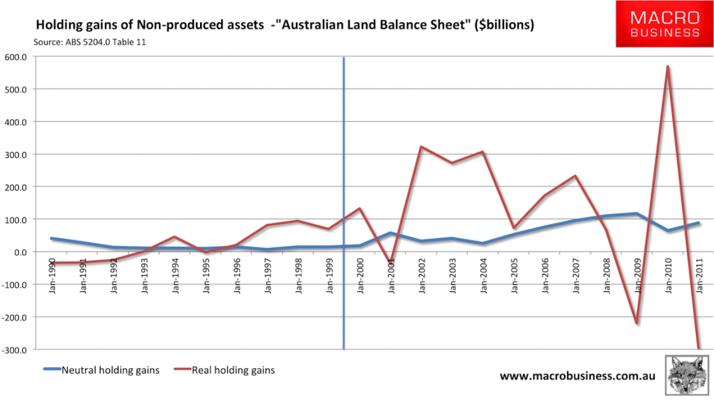
We can dig a little deeper into the ‘land balance sheet’ in the system of national accounts, and look closely at the type of increases in land value estimated. The chart below shows in blue the neutral holding gains – that is, the change in the value of land expected if prices tracked inflation. In red we see the real holding gains, which are market-based increases in land values. As the ABS notes “Holding gains and losses accrue to the owners of assets and liabilities purely as a result of holding the assets or liabilities over time, without transforming them in any way”. In economic terms, they are pure rents.
When red is greater than blue, we find a significant downward bias in the MFP estimate. It is really that simple. And we are not alone in this either. Spain’s land price boom resulted similar pattern of declining MFP during their land price boom in the early 2000s.
Let us wrap up by summarising the key points from this analysis.
- Australia is not performing abnormally low by international standards in productivity growth.
- Labour productivity is the most important productivity measure, and improves almost entirely through capital accumulation.
- Labour productivity is usually biased by changes in unemployment. Reduction in unemployment results in a downwards bias as new labour is employed before capital can be produced to help the expanded workforce produce more effectively.
- Multifactor productivity is the bit left over after adding up all the economy’s outputs and subtracting all the inputs. It typically captures compositional changes in goods produced.
- Multifactor productivity has fallen mostly because the denominator of the productivity equation has been so heavily influenced by inflated land prices across all sectors since 2002. I expect if the slow melt in land prices continues we will see a ‘surprising’ recovery of the multifactor productivity measure in the coming years.
Tips, comments and suggestions to rumplestatskin@gmail.com or follow me on Twitter @rumplestatskin

