Working hours are falling

Courtesy of Mark the Graph.
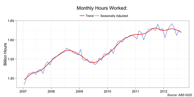
I have already noted that the total hours worked has plateaued in recent months. This is the key chart.
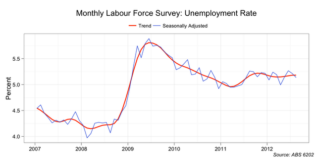
While hours worked has plateaued, the unemployment rate has been largely unchanged at around 5.2 per cent since mid 2011.
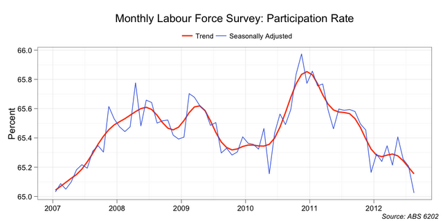
In part, this has been achieved by a reduction in size in the labour force.
With that background, let’s have a look at whether a further explanation is that people are working fewer hours each week.
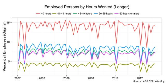
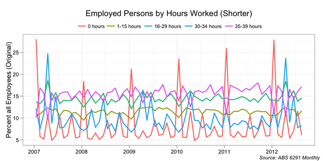
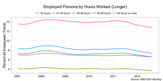
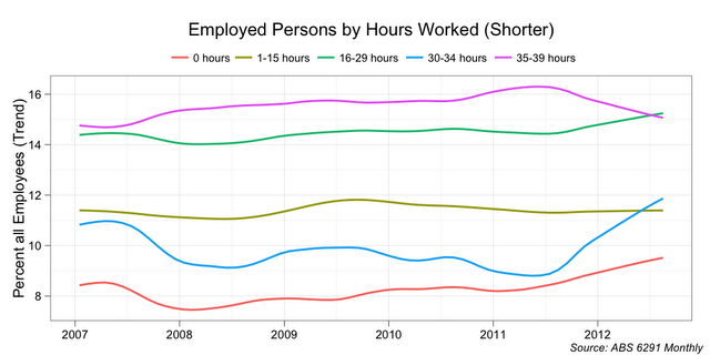
In the next chart I look at the count of employed persons (as a percent of all employed persons) in each cohort. The cohorts are based on the number of hours actually actually worked in the week of the Monthly Labour Force Survey.
The detailed hourly cohort data is incredibly noisy. It has significant January and Easter seasonal effects, and lesser school holiday effects. Fortunately we can look behind these seasonal effects with a seasonal decomposition.
Since the start of 2011, we can see a greater proportion of employees working zero hours in the period. This could be more people feeling able to take holidays (or being told to take leave). And it could be more people with irregular hours getting no work.
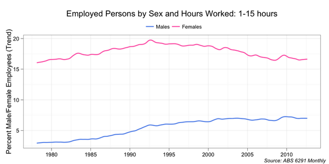
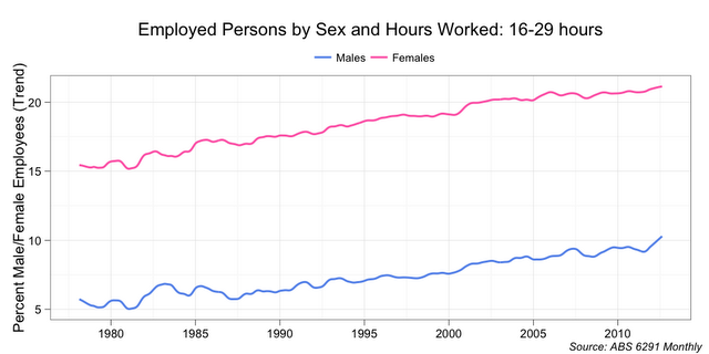
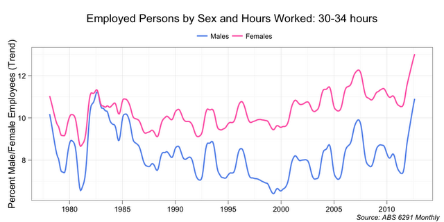
Since the middle of 2011, we can see a greater proportion working 16-29 hours and 30-34 hours per week.
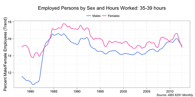
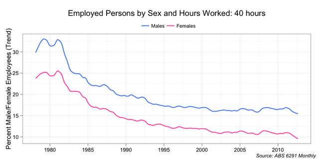
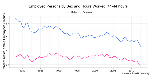
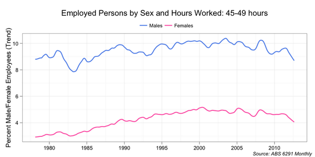
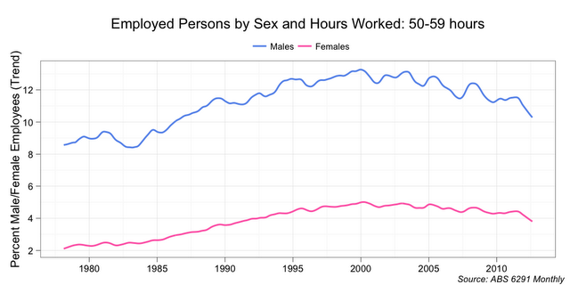
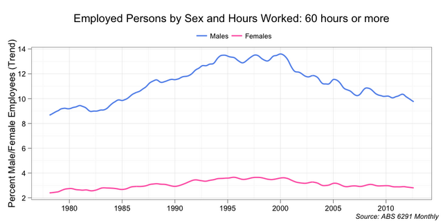
At the same time, the proportion of employees in each of the hourly cohorts from 35 to over 60 hours per week has declined.
One possible conclusion: a contributor to Australia’s stable unemployment rate has been a sizable proportion of employees working fewer hours each week. The other key contributor has been the decline in the participation rate.
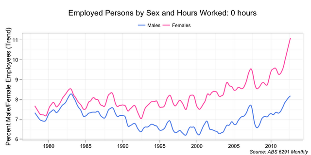
Update: the gender break downs are interesting.

