
Courtesy of Mark the Graph.
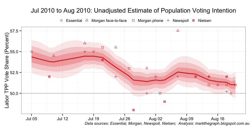
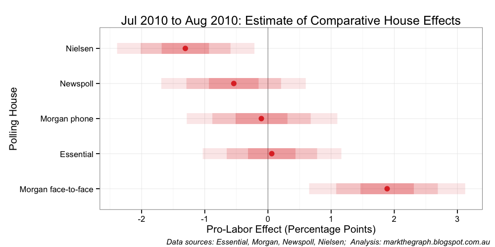
Yesterday, I looked at the house effects in the opinion polls following the elevation of Julia Gillard up until the 2010 Federal Election (actually a slightly narrower period: from 5 July to 21 August 2010). The key charts were as follows.


The house effect difference between the polling houses can be summarised in terms of relative percentage point differences as follows:
- Between Morgan face-to-face and Essential: 1.83 percentage points
- Between Essential and Morgan phone: 0.17 percentage points
- Between Morgan phone and Newspoll: 0.43 percentage points
- Between Newspoll and Nielsen: 0.78 percentage points
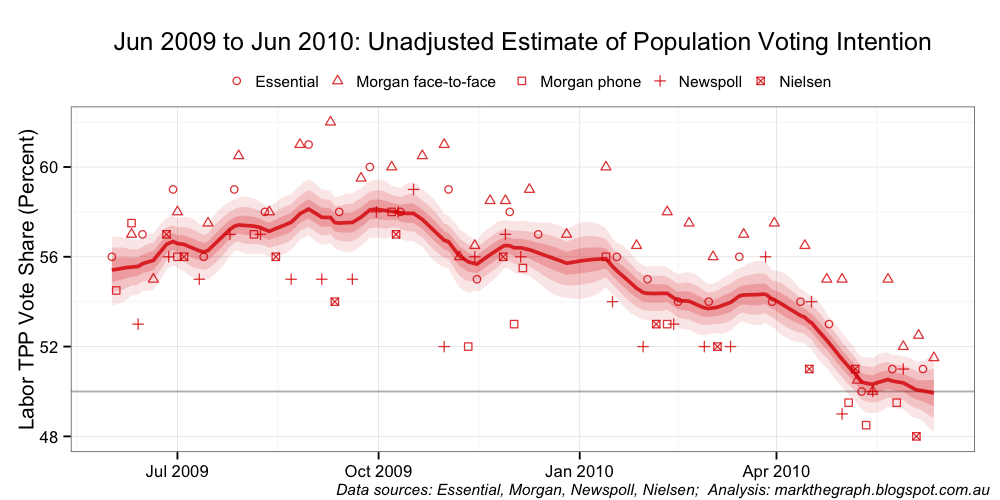
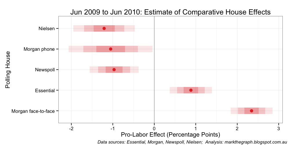
Unfortunately, apart from elections we cannot benchmark the opinion polls to the actual population wide voting intention. We can, however, benchmark the polls against each other. I have adjusted my JAGS code so that the house affects must sum to zero over the period under analysis. This yields the next two charts covering the same period as the previous charts.
While this sum-to-zero constraint results in a biased estimate of population voting intentions (it’s around 1 per cent pro-Labor compared with the initial election-outcome anchored analysis), the relative house effects remain largely unchanged in the analysis for the period:
- Between Morgan face-to-face and Essential: 1.83 percentage points
- Between Essential and Morgan phone: 0.16 percentage points
- Between Morgan phone and Newspoll: 0.44 percentage points
- Between Newspoll and Nielsen: 0.77 percentage points
In plain-English – the shape of the population voting curve is the same between the two-approaches; what has changed is the vertical position of that curve.
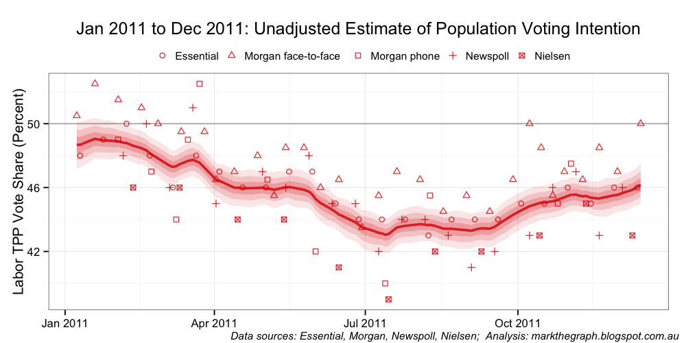
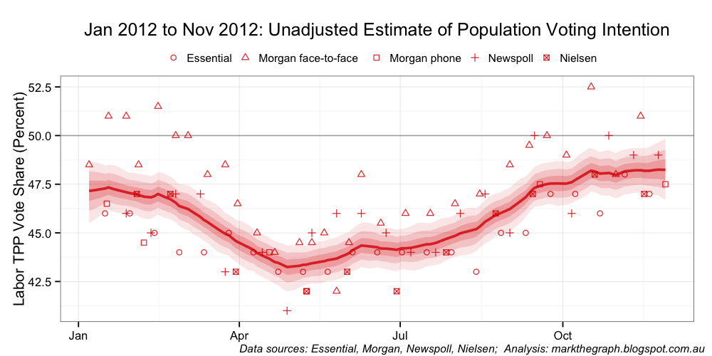
If house effects were constant over time, it would be easy to apply this bench-marked effect to future polls. Unfortunately house effects are not constant over time. In the next three sets of charts we can see that the relativities move around – some quite markedly. The charts span three roughly one-year periods: Kevin Rudd’s last 12 months as leader; calendar year 2011; and calendar year 2012.
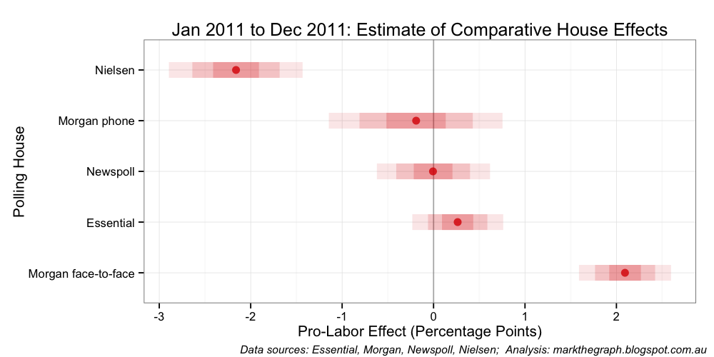

The intriguing question I am left pondering is whether Essential has made changes to its in-house operations that have affected its relative house effects position. It also has me wondering how much I should adjust (move up or move down) the unadjusted estimate of population voting intention to get a more accurate read on the mood of the nation.
And the most recent three months … which might just be a pretty good proxy for how the population voting trend is tracking at the moment.


Caveat: this analysis is a touch speculative. If you see errors in my data or analytical approach, or have additional data you can give me, please drop me a line and I will re-run the analysis.
