
Cross-posted from David Collyer at Prosper
Young academic Philip Soos has developed a unique Australian property database that allows us to inspect the entrails from many angles and in detail. Some data dates from as early as the mid-1800’s. We owe him thanks for this selfless public service. You can access his spreadsheets here.
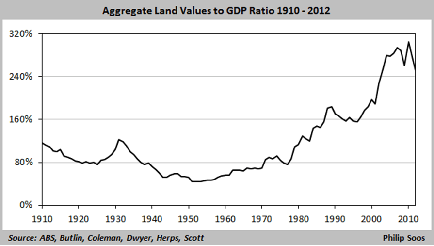
There are useful insights in comparing land prices to Gross Domestic Product. This measures the land intensity of economic activity, as well as the speculative impulse – how much of our earnings are we prepared to divert to land?
If land prices had been lifted solely by higher earnings and muscular growth, the graph below would be flat. Ditto if inflation was the key, as GDP would inflate at a similar rate.
Instead, this alarming exponential curve below points to the land component of property becoming more and more expensive compared to our overall output. Other sectors have contracted, notably construction which has been in retreat for a decade. We funded this land inflation with debt.
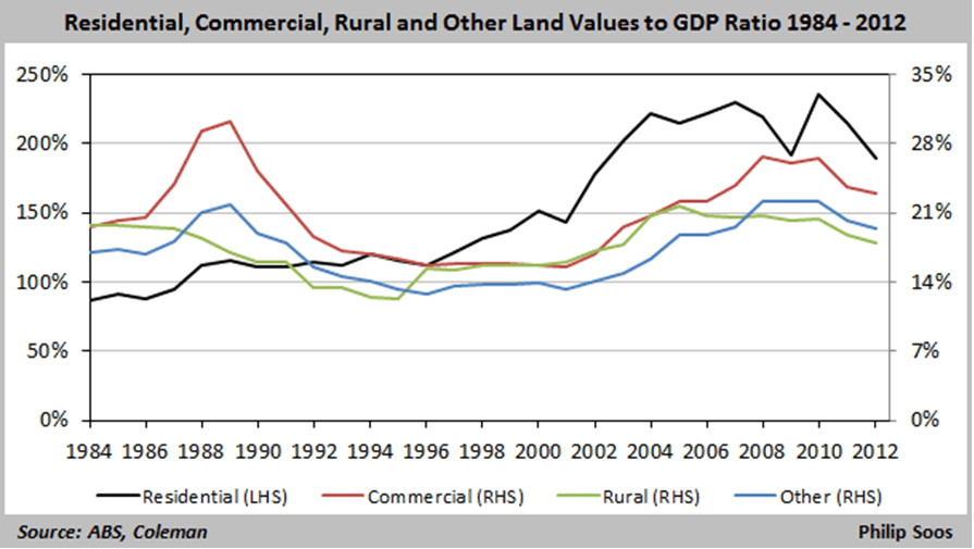
Breaking out the national figures into residential, commercial, rural and other (below) highlights the strong commercial and rural weighting of the 1988-90 peak and bust. Nationally, the aggregated residential trend barely moved.
In 1996, by this measure, residential began its stellar climb to over 200 per cent of GDP in 2003, where it has remained in a severely unaffordable band for a decade.
Current market commentary refers excitedly to a current uptick from the ~195 per cent of GDP it declined to last year. Meanwhile, commercial is retreating as widespread and persistent vacancies cap growth and cash returns.
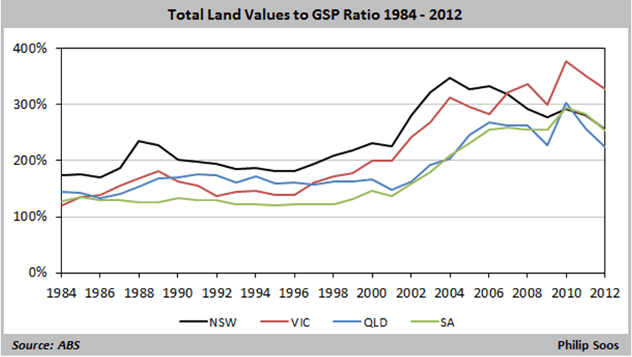
State by state, New South Wales peaked early; Brisbane River floods turned Queensland down decisively in 2011; and South Australia followed the disastrous national trend. The stand-out is Victoria which appears determined to eat its young.
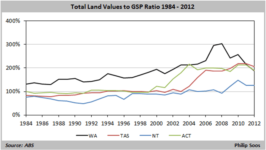
Of the remaining states below, only Western Australia participated fully in The Great Australian Land Bubble, driven by the once in a century mining investment boom. Very strong GSP growth reduced the land intensity, though this beneficial phase looks to be over as investment grinds to a halt.
ACT land intensity doubled in 1999-2004 and tracked in a narrow channel since.
Real estate professionals are fond of pointing out that all property is local. That beguiling phrase deflects arguments about absolute value to focus on relative value. Are flats cheaper than houses? Is one suburb ‘accelerating’ faster than another?
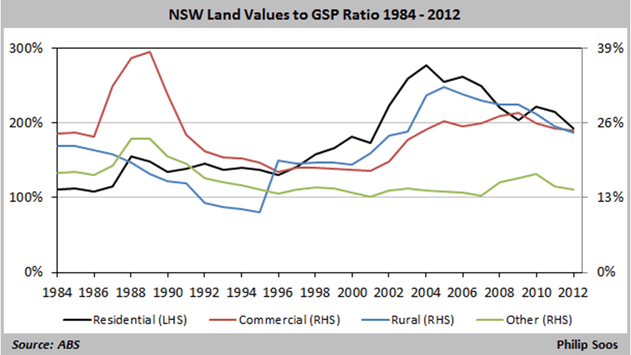
In NSW, below, the spectacular 1988-89 Sydney-centric commercial property bubble and painful 13 year price retreat are clearly shown. There was limited residential participation in this bubble. The breaking of five years of drought in 1995 was immediately capitalised into rural prices, which rose thereafter alongside residential.
This graph clearly illustrates the speculative fever in residential prices peaked early this century, prompting Property Observer’s Terry Ryder to wail last Monday, “Sydney has been an investor’s nightmare since 2004.”
By this price/GSP measure, the great run up 1995-2004 has been in modest retreat ever since – the land intensity has been declining – even as nominal prices continue to rise.
Victoria’s 1987-89 commercial bubble equalled NSW’s, again with limited effect on residential prices, below. The construction of 333 Collins Street Melbourne stands out for destroying the State Bank of South Australia and the State Bank of Victoria.
The current boom has stoked both residential and commercial values.
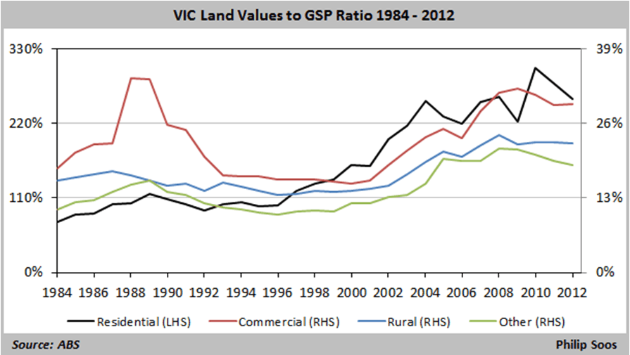
So, when land prices normalise, Victorian residential and commercial land prices have the furthest to fall. It looks like Northern Territory ex-Darwin is the safest place to buy – if you can find work.

