The share market is waking up a touch to deteriorating iron ore markets today with the junior miners big losers, FMG and Rio down 2-3%.
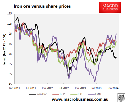
As such I thought I’d take a quick look at correlations between the iron ore price and miner share prices since the peak in 2011. Here is an index chart of the majors versus the iron ore price:

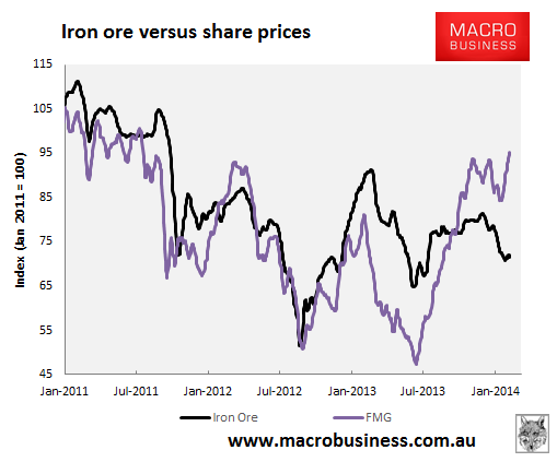
Perhaps surprisingly, since iron began its great correction in 2011, over the stretch it is FMG that has performed best. This, however, masks considerable volatility. Here’s the individual chart:

The share price has decoupled from the ore price twice over the past year, first when it faced a crisis of confidence through to mid last year, and now after the huge rally once confidence that FMG would survive was restored. In fact the decoupling is very wide right now, and even today FMG is down only 2% when in the past it would have been hit harder on current iron ore ructions. The market is not seeing it as an “all or nothing” bet at the moment.
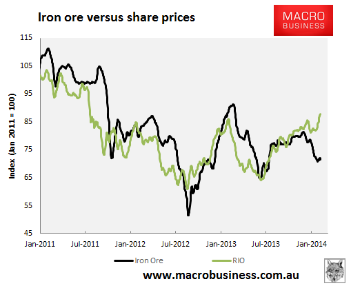
The same decoupling is apparent in the Rio share price as sell-side analysts have bought into the cost-out deflation story and good earnings from last year’s ore price strength, especially over the recent profits season as the iron ore price fell:

However, if iron ore prices fall sharply from here, especially near or below $100, I do not expect these divergences for the two iron ore majors to hold, or not so firmly anyway. “Catch-up” falls are a good prospect.
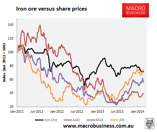
For the juniors, a lot more of the damage of the past two years is still intact:

With the exception of BCIron which I couldn’t chart because its returns are so enormous.

