The corrected CBA-HIA housing index

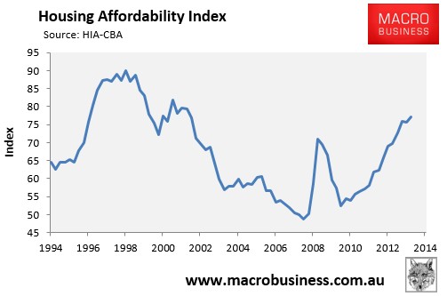
Over the past two days (here and here) I have uncovered how the the CBA-HIA housing affordability index, which shows Australian housing affordability at its most favourable level since March 2002 (see next chart), is built on highly dubious data.

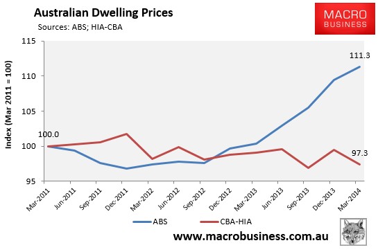
The main issue centres around its dwelling price series, which is based on home loans financed by the CBA during the quarter, and curiously shows that Australian home prices have been falling, despite every other data provider (including the ABS) reporting strong price growth (see next chart).

As shown above, the CBA-HIA measure of median dwelling prices curiously claims that home values fell by 2.7% in the three years to March 2014, whereas the official ABS property price index shows an 11.3% increase in dwelling values over the same period.
A lower dwelling price, other things equal, results in a lower monthly mortgage payment and a higher affordability rating.
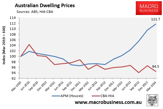
To illustrate the impact on affordability in greater detail, I have reconstructed the CBA-HIA housing affordability, substituting the CBA-HIA’s faulty dwelling price data with APM’s stratified median house price series. Like the ABS, APM have reported strong price growth, which contradicts the falling values used by the CBA-HIA (see next chart).

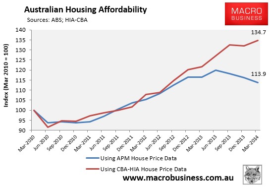
By adopting the identical methodology as CBA-HIA (i.e. 90% LVR, same mortgage rates and same income), but substituting APM’s house price series for the CBA-HIA’s, you can see that Australian housing affordability has in fact been falling since June 2013 (see next chart).

This is yet more evidence that the CBA-HIA housing affordability index is bogus, and Australian consumers have been mislead by the mainstream media, which published the CBA-HIA results unchallenged.
