Over the years MB has been a fan of CoreLogic. Its analysis is mostly impartial and its index was the best in the country.
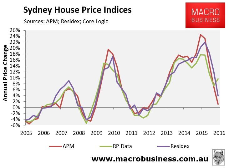
However, along with the RBA, our faith in its index has been shaken by its shift in methodology in May this year which has resulted in a very unusual divergence in the various national house price indexes:

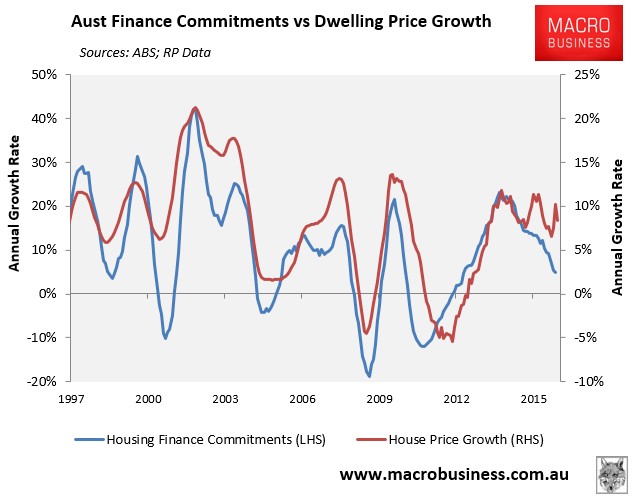
And an even more unusual divergence between credit metrics and the CoreLogic house price index:

Meanwhile, despite the RBA, the media and markets continue to use CoreLogic and as such a very disruptive wedge has been driven into monetary policy making and its narrative. Yesterday the RBA sounded quite unsure:
The best available information suggests that dwelling prices overall have risen moderately over the past year and growth in lending for housing purposes has slowed.
“Best available” is not good enough for this crucial metric.
So, my challenge to CoreLogic is simple. Please publish as soon as possible an updated chart that compares the changes in the price indexes since May using your new index method versus what they would look like using your old index method.
It’s in the national interest so I urge haste.

