Cross-posted from The Conversation:
With affordable houses increasingly out of reach, wage growth slow and household debt high, Australians are certainly feeling poor. But how do they compare to their neighbours? New Census data confirms there’s a lot of variability in income.
The Census breaks the country up into 349 geographic regions (named in quote marks below), some of which cover more than one major town and some of which group related suburbs within cities. We examined 331 of these regions, excluding those containing fewer than 1,000 households.
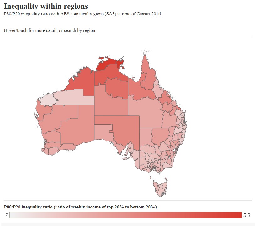
The data show there are high levels of income inequality within these regions. A simple way to measure this is to look at the ratio of income between those who are well off (the top 20% within a region) and of those who are relatively disadvantaged (the bottom 20%) in the Census data. In Australia the weekly household income for the top 20% (A$1,579 per week) is 3.5 times the income of the bottom 20% (A$457).
The “Melbourne City” region has the most unequal incomes in Australia, where the top 20% have an income that is 8.3 times as high as those in the bottom 20%. “Adelaide City” (ratio of 5.5) and the “Sydney Inner City” (4.8) also have quite high levels of inequality.

Two of the poorest regions in the Northern Territory also have very high inequality. These are the vast region that encircles Darwin, called “Daly, Tiwi, West Arnhem” (ratio of 5.2) and the “East Arnhem” region (5.3).
However, there are regions with varying income levels, that also had relatively low inequality ratios. The region of “Molonglo”, in South Canberra (ratio of 2.2), “West Pilbara” in Western Australia (2.4) and “Kempsey, Nambucca” on New South Wales’ north coast (2.5) all have low levels of inequality.
For our analysis, we used equivalised household income. Equivalisation is a technique in which members of a household receive different weightings, based on the amount of additional resources they need.
The Australian Bureau of Statistics assumes that the first adult in a household has a weighting of 1, each additional adult a weighting of 0.5, and each child a weighting of 0.3. Total household income is then divided by the sum of the weightings for a representative income.
Incomes across Australia
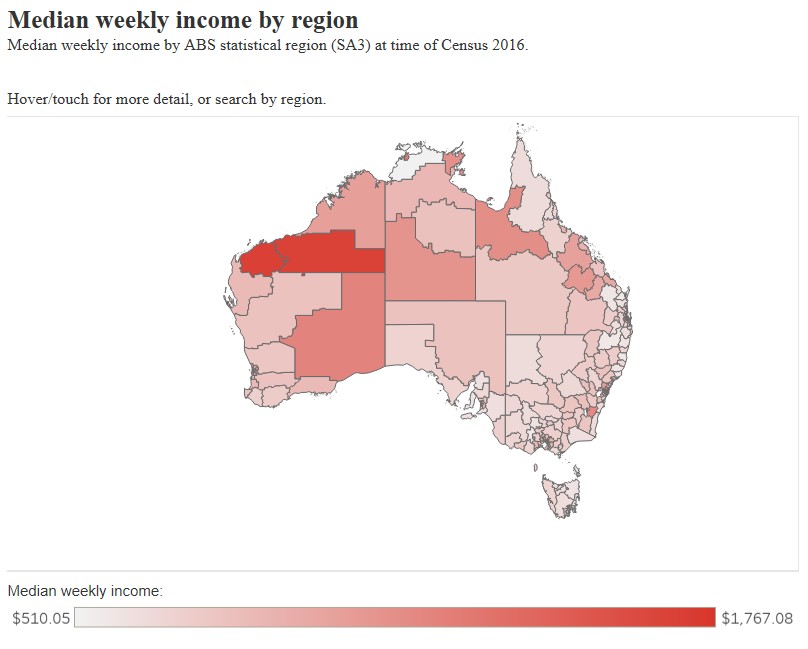
For the whole of Australia, the equivalised median household income (the income in the middle of the distribution) is A$878 per week. The region with the lowest median income was “Daly, Tiwi, West Arnhem” in the Northern Territory, at A$510 per week.

However, several regional areas like “Maryborough, Pyrenees” (northwest of Ballarat in Victoria), “Kempsey, Nambucca” (NSW), “Maryborough” (between Bundaberg and the Sunshine Coast in Queensland), “Inverell, Tenterfield” (in NSW’s Northern Tablelands) and “South East Coast” in Tasmania all had median incomes of A$575 per week or less.
At the other end of the distribution, households in leafy suburbs of North Sydney – “Mosman” (NSW) had a median income of A$1,767 per week. Areas like “South Canberra” (ACT), “Manly” (in Sydney’s east) and the mining-dominated “West Pilbara” (WA) all had median incomes of A$1,674 or more per week.
We also looked at the extremes of the distribution. We define high income as those households with an income of A$1,500 or more per week. This equates to about 22% of the population. We defined low-income households as having an income of less than A$400 per week (about 14% of households).
Around 40% of households in the “Daly, Tiwi, West Arnhem” region were classified as being in poverty compared to around 6% in “North Sydney, Mosman” region. Conversely, around 60% of households in this region were classified as having high income, compared with only 6% of households in “Kempsey, Nambucca”.
How segregated are we within regions and cities?
While government policy is often delivered at the regional level, people live their lives at the local or neighbourhood level. However, the relatively disadvantaged and the upper-middle class are often segregated within these regions.
Richard Reeves of the Brookings Institute argues the segregation of the upper-middle class in Australia means this group “hoards” the benefits in the region they live in. Among the location advantages he lists are: access to the best schools, opportunities to network with the wealthy and powerful and the ability to disproportionately accrue capital gains on housing assets. To avoid this kind of “opportunity hoarding”, the rich and poor would need to be evenly spread within a region.
A simple way to look at this is through a “dissimilarity index”. In essence, this measures the evenness with which two groups are spread across a larger area. It ranges from zero to one, with higher values indicating a more uneven distribution and zero indicating complete mixing.
Looking at the distribution of the high income. Across Australia, the dissimilarity index has a value of 0.27. This means that around 27% of high-income households would have to move neighbourhoods to make the distribution completely even.
This varies quite substantially by region. “Far North” (encompassing Cape York in QLD) has a dissimilarity index of 0.42. “Auburn” (in western suburbs of Sydney, NSW) and “Playford” (on Adelaide’s northern fringe) also have quite large values.
Our richest regions tend to have the most even distribution of the wealthy, with “North Sydney, Mosman”, “Molonglo” and “Manly” having values of 0.06 or less.
“East Arnhem” has a very high level of concentration of low income individuals by neighbourhood, with a dissimilarity index of 0.70. The next two highest regions (“Katherine” and “Alice Springs”) are also in the Northern Territory, with index values of 0.53 and 0.55 respectively.
We can also compare the measures we used, to find out how they relate to each other. The following figure shows that the richest regions tend to be those with the highest level of income inequality.
However, as inequality goes up, there tends to be a greater concentration of low income households by neighbourhood (there’s also less of a concentration of high income households).
Have and have nots
It’s true that the level of income mobility is higher in Australia than it is in the US. However, Australia also has prominent examples of economic policies that disproportionately benefit the upper-middle class, such as the capital gains tax discount and superannuation tax incentives.
Australia also has a geographically concentrated income distribution, with the rich living in neighbourhoods with other rich people. The poor are also more likely to live in close proximity to people who share their disadvantage.
If Richard Reeves is right, and the spatial segregation of high and low income households reinforces inequality across the generations, then policies that encourage the mixing of different social classes in the same neighbourhood and region should be a way forward.
Article by Nicholas Biddle and Francis Markham by the Australian National University