Inside the Australian economy’s engine
The Reserve Bank of Australia released its latest monthly chart pack so of course, I have to take a squiz as they say and check out the latest chalk scratchings and dart throwing at a forecast abilities of the boffins at Martin Place.
Let’s look at the most important economic indicator that actually doesn’t mean a lot to the average persion – GDP:
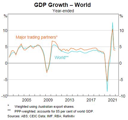
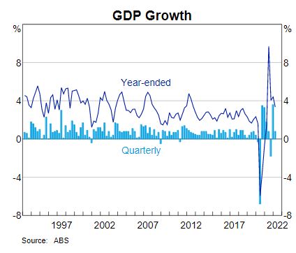
Down, up then back to what it was pre-COVID? Like perspex coffins, it remains to be seen where this is going. Locally the retraction is a bit steeper, but that’s largely due to the inefficiencies of the economy post 2008, where GDP headline growth was only really being driven by rising population (more people = more spending = huzzah = more growth), and lately, governments printing money hand over fist:
Inflation is always troublesome though:
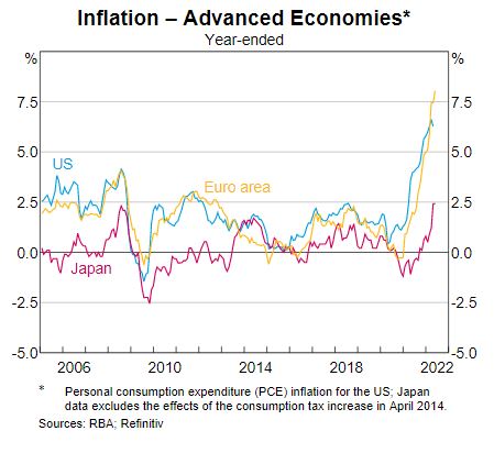
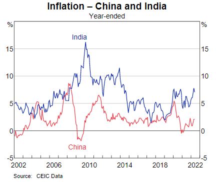
Not quite 1970s, but its hitting new highs for sure, although in the other half of the brick, its somewhat contained:
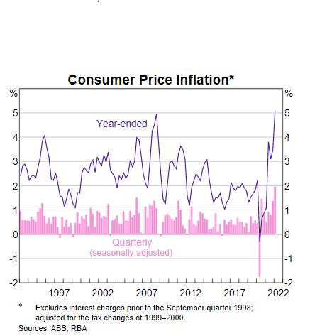
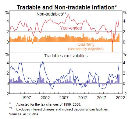
Again locally its a bit more troublesome, with the RBA partly to blame on its three monkey approach to economic management, not helped by a near decade long malinvestment in energy security by the former government:
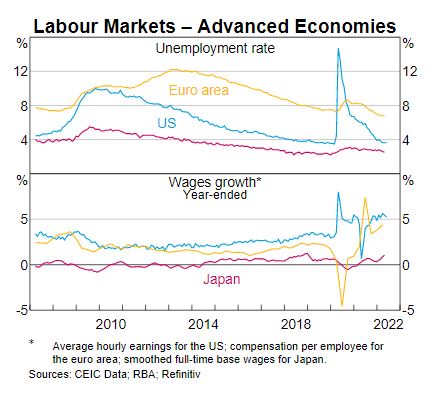
Unemployment matters most although like our own numberwang approach, these numbers have to be taken with a grain of salt:
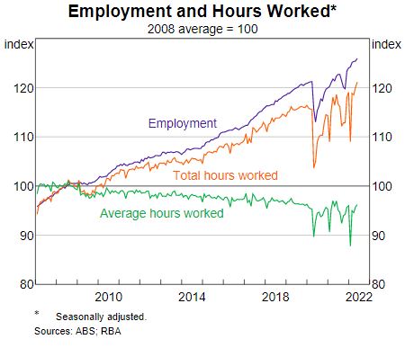
So while the Kouk’s all applaud the super low unemployment numbers, the average hours worked remains stuck at pre COVID levels:
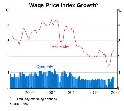
And the wage price spiral is nearly non-existent and definitely not keeping up with inflation:
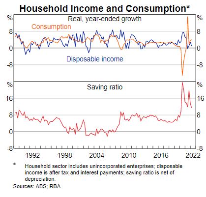
Households are spending and saving even though disposable income growth is flat lined – riddle me that Batman:
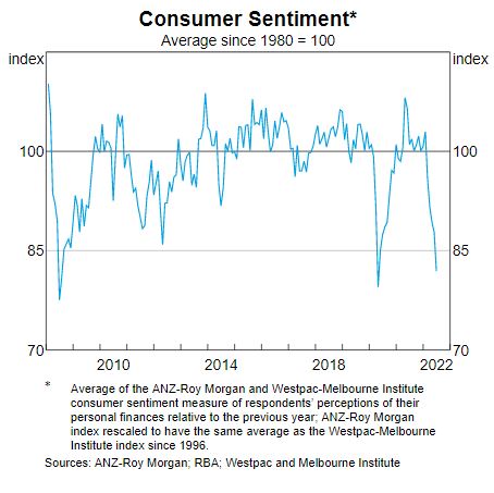
All the while consumer sentiment is literally at the floor, back to GFC like levels:
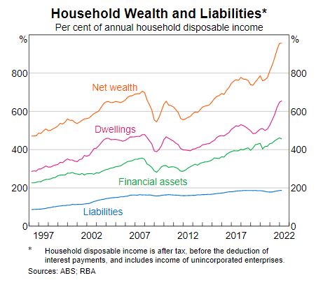
But everything is awesome since net wealth has never been this high in the history of Federation, mainly due to the engineered bubble in housing of the last couple of years:
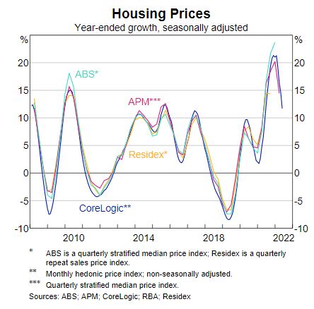
Which is very slowly deflating:
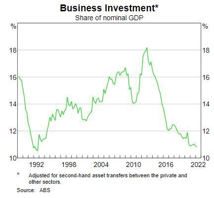
While business investment is just cratering – well done Scomo:
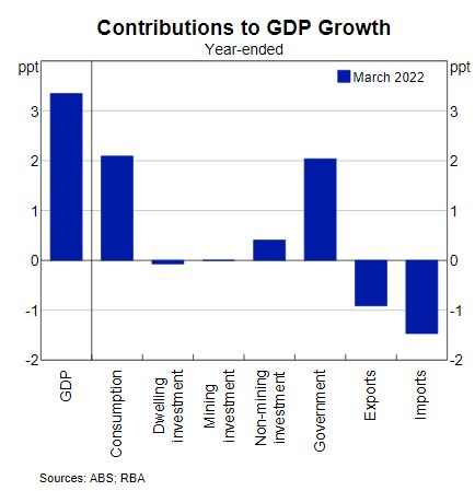
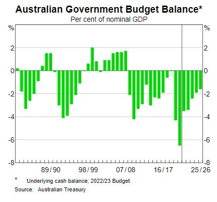
If you look through the numbers, its really just government spending keeping things afloat – ignore those forecasts to the right, its not happening Jan:
Bet the RBA wishes this chart doesn’t change soon – the other half of the economy holding up pretty much the whole shebang:
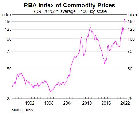
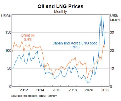
And its really all because of coil, oil and LNG prices that have gone to the moon after the orcs invaded Ukraine:
If only there was a policy that could reserve some of these exports? At least coal is slowly dying, but not fast enough:
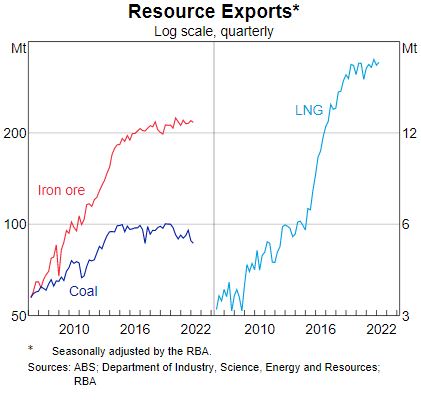
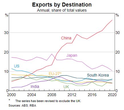
Yo ho and off to the Middle Kingdom, forget about the rest – diversification is for wimps:
See that blip? That blip could kill the housing bubble. Keep blipping little fellah:
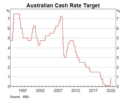
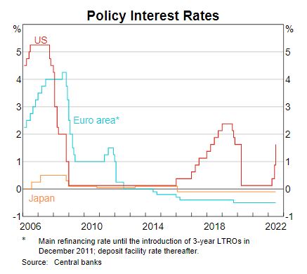
Still some catching up to do before we get back to pre-GFC “normal” rates? Or will CB’s ever be normal?
