Justin Fabo at Antipodean Macro has created a bunch of charts showing how actual mortgage rates paid by Australians continue to rise as a result of the continual expiry of cheap pandemic fixed rate mortgages.
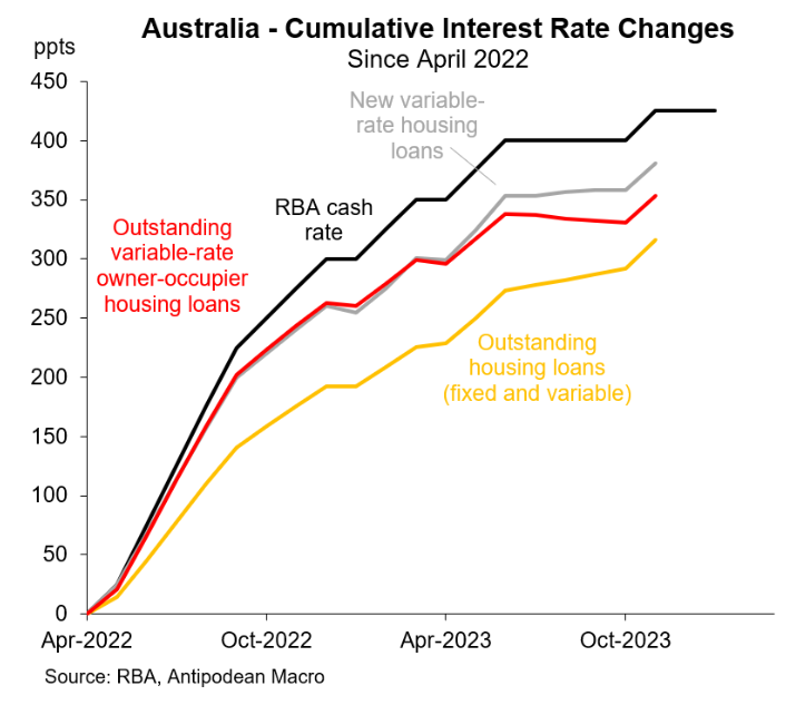
The first chart below from Fabo shows that both weighted-average outstanding and new variable mortgage rates hit new highs in November:

However, “the weighted-average interest rate on outstanding housing loans had risen by 110bps LESS than the rise in the RBA cash rate since April 2022”, notes Fabo, although “this gap will narrow as more fixed-rate mortgages expire”.
“Rates on outstanding variable-rate housing loans have risen by 70bps less than the cash rate”, says Fabo.
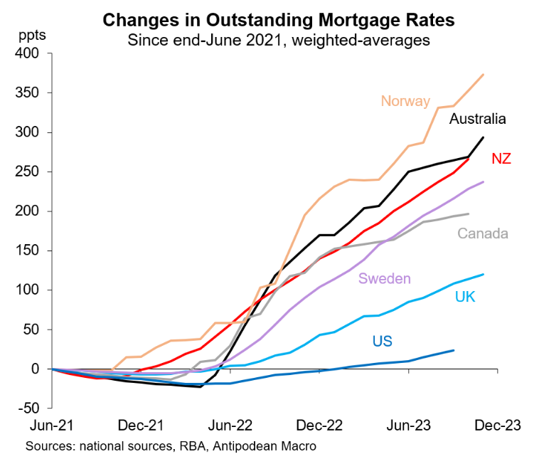
The next chart from Fabo shows that the increase in interest rates in Australia has been especially brutal, beaten out by only Norway:

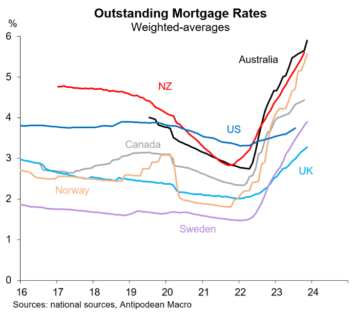
Average outstanding mortgage interest rates in Australia are also relatively high:

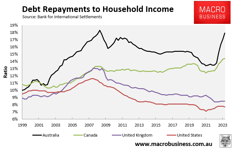
Separate data from the Bank for International Settlements (BIS) shows that the aggregate share of household income going to debt repayments (i.e. both principal and interest) has risen most sharply in Australia:

The above charts reflect the fact that Australia has one of the highest concentrations of variable rate mortgages in the world.
This has meant that even though Australia’s official cash rate (OCR) has risen by less that some other nations (e.g. New Zealand and the United States), the predominance of variable rate mortgages has meant that Australia’s OCR has been passed on more quickly to mortgage holders.
These charts also explain why the RBA will not need to raise interest rates as much to dampen demand and inflation.
Australian households are already hurting, as illustrated in the above BIS chart.

