I made the point last week in responding to local propagandists that Chinese urbanisation was on the verge of collapse:
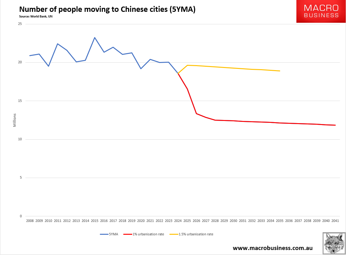
This is a simple case of demographic arithmetic, but the local’s livelihood prevents them from seeing the oncoming truck, so here are a few more charts from Dragonomics that make the same point.
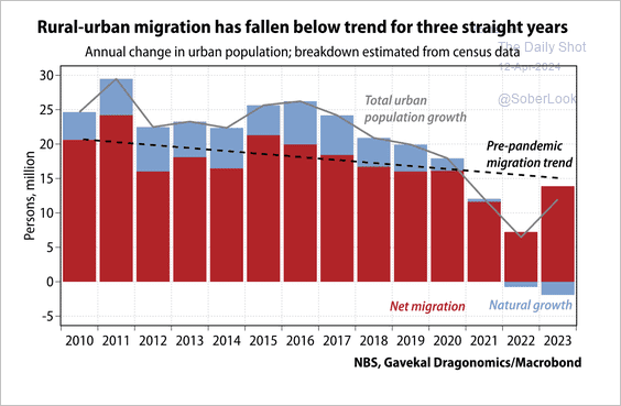
The recent trend is not their friend. It is worse than my chart:
Advertisement
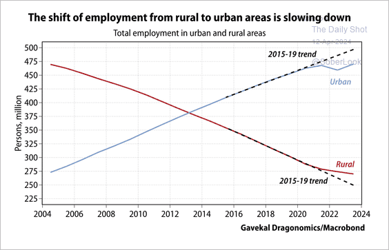
And the long-term trend break says it all:
These are much worse numbers than my own. Anybody making a business case based on the endless shift of warm bodies from city to country in China is in complete denial.
Advertisement
That is Australia.